16 Mid Century Modern Color Palettes Designers Love

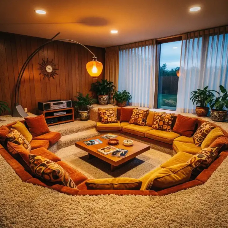
1. Mustard Yellow and Walnut
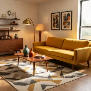
Mustard yellow paired with rich walnut wood creates a classic mid century modern palette that feels warm and nostalgic. The golden tone adds vibrancy without overwhelming the room, while walnut furniture introduces depth and natural texture. Together, they evoke the iconic interiors of the 1950s and 1960s.
Balance the bold mustard shade with neutral walls like soft white or beige. Add geometric patterns through rugs or cushions to enhance the retro aesthetic. This palette feels cozy yet stylish, making it a favorite among designers for creating inviting mid century spaces.
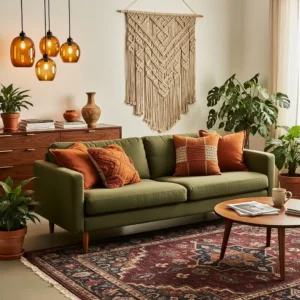
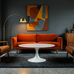
2. Teal and Burnt Orange
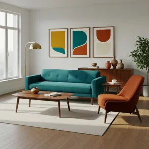
Teal and burnt orange are a striking combination that captures the playful energy of mid century design. The cool depth of teal contrasts beautifully with the warmth of burnt orange, creating visual balance. This palette adds personality while maintaining a sophisticated feel.
Keep surrounding elements simple so the colors stand out naturally. Incorporate wood finishes and brass accents to enhance the vintage vibe. The result is a dynamic yet harmonious space that reflects the bold creativity of mid century interiors.
3. Olive Green and Cream
Olive green paired with cream creates a calm and earthy mid century palette. The muted green tone reflects nature while cream softens the overall look, preventing the space from feeling heavy. This combination works beautifully in both living rooms and bedrooms.
Layer textures such as wool, linen, and wood to add dimension. Minimal decor and clean-lined furniture allow the palette to shine. Designers love this combination for its ability to feel both relaxed and timeless.
4. Charcoal Gray and Mustard
Charcoal gray introduces a modern depth to mid century interiors while mustard adds warmth and vibrancy. The dark backdrop allows brighter accents to pop, creating a dramatic yet balanced atmosphere.
Combine charcoal walls with wooden furniture and soft lighting for warmth. Mustard upholstery or cushions provide just the right amount of retro flair. This palette works particularly well in contemporary homes inspired by mid century design.
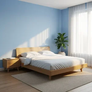
5. Aqua Blue and White
Aqua blue and white create a fresh palette reminiscent of classic mid century kitchens. The cool aqua shade feels playful and uplifting, while crisp white keeps the space bright and clean.
Add chrome fixtures and simple cabinetry to enhance the vintage feel. Keep decor minimal so the color combination remains the focal point. Designers often use this palette to create cheerful spaces with authentic retro character.
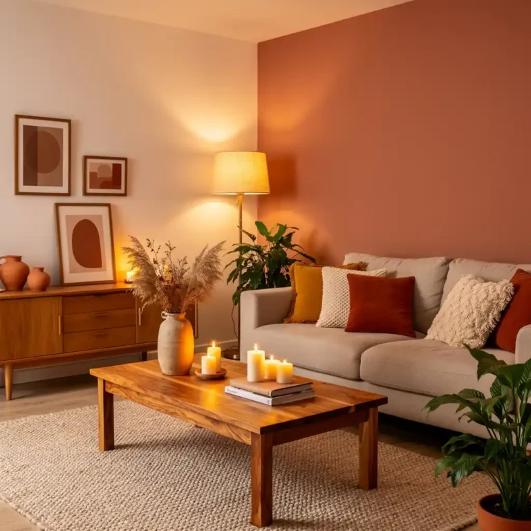
6. Rust and Beige
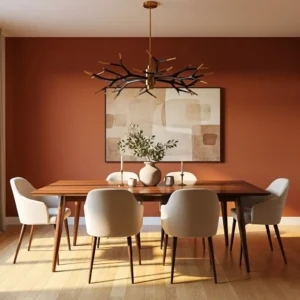
Rust tones paired with beige create a warm, earthy palette rooted in natural hues. The deep orange-brown shade adds richness, while beige keeps the space light and balanced.
Introduce wood furniture and textured fabrics to enhance the cozy feel. This palette works beautifully in living rooms where warmth and comfort are priorities. Designers appreciate its timeless and grounded quality.
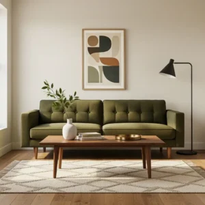
7. Avocado Green and Brown
Avocado green became an iconic color during the mid century era. Paired with warm brown tones, it creates a nostalgic palette that feels both bold and organic.
Balance the strong green shade with neutral walls and simple décor. Wooden countertops or shelving complement the palette perfectly. This retro combination remains a favorite for authentic mid century inspired interiors.
8. Navy and Walnut
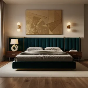
Navy blue and walnut offer a refined take on mid century color palettes. The deep blue tone adds sophistication while walnut wood introduces warmth and texture.
Use navy on upholstery or accent walls while keeping surrounding colors light. Metallic accents such as brass enhance the elegant feel. Designers love this palette for its ability to feel both classic and modern.
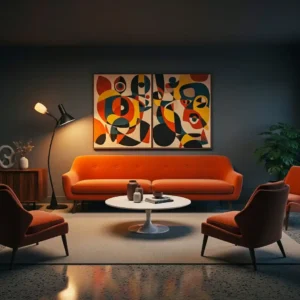
9. Coral and Teak
Coral adds playful brightness to mid century interiors while teak wood provides warmth and richness. The vibrant coral shade energizes the room without overwhelming the design.
Pair coral seating with teak furniture and simple décor. Keep the overall palette balanced with neutral walls and subtle patterns. This lively combination perfectly captures the spirit of mid century creativity.
10. Sage Green and Oak
Sage green paired with oak creates a soft, nature-inspired palette. The muted green tone feels calming, while oak wood adds warmth and texture.
Keep furnishings simple and clean-lined to highlight the palette. Layer neutral textiles for comfort. Designers appreciate this combination for its relaxed elegance and timeless appeal.
11. Black and Warm Wood
Black combined with warm wood creates a bold yet balanced mid century palette. The dark tone adds contrast and modern sophistication, while wood softens the look.
Use black sparingly through accent walls or décor elements. Pair with walnut furniture and neutral fabrics for harmony. This palette works well in contemporary homes inspired by mid century design.
12. Pale Pink and Walnut
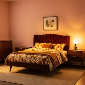
Pale pink brings a gentle warmth to mid century interiors when paired with walnut wood. The soft tone feels elegant rather than overly feminine, especially when balanced with rich brown furniture.
Add neutral textiles and minimal décor for cohesion. This palette works beautifully in bedrooms or cozy living spaces. Designers love it for its understated charm and modern appeal.
13. Golden Yellow and Gray
Golden yellow combined with gray creates a vibrant yet balanced palette. The bright yellow tone adds energy while gray provides a calming backdrop.
Incorporate wood furniture and simple décor to maintain the mid century aesthetic. This palette works especially well in living rooms where bold accents can shine without overwhelming the space.
14. Turquoise and White
Turquoise and white evoke the playful spirit of mid century bathrooms and kitchens. The bright turquoise shade adds personality while white keeps the space fresh and clean.
Pair with chrome fixtures and simple geometric patterns for authenticity. This palette brings retro charm while remaining crisp and modern.
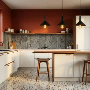
15. Earthy Brown and Orange
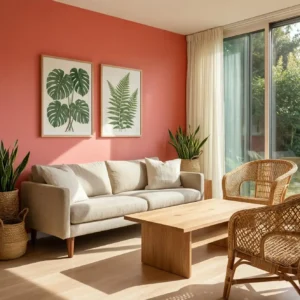
Earthy brown and orange reflect the natural influences of mid century design. The warm tones create a cozy and inviting environment perfect for relaxed living spaces.
Balance these rich colors with neutral walls and simple furnishings. Wooden furniture enhances the palette’s organic feel. Designers often use this combination to evoke vintage warmth.
16. Moss Green and Cream
Moss green paired with cream creates a serene and sophisticated palette. The deep green tone adds depth while cream keeps the space bright and airy.
Add walnut furniture and soft textiles for warmth. Keep decor minimal so the colors remain the focal point. This palette beautifully blends nature-inspired tones with mid century elegance.