23 Rustic Christmas Color Palette Ideas
1. Cranberry Red and Balsam Green
Cranberry red and balsam green is the most timelessly beloved and most deeply emotionally resonant rustic Christmas color palette of the entire holiday season, combining the deep jewel richness of genuine cranberry — not the sharp synthetic red of commercial Christmas decorating but the complex, blue-toned crimson of actual winter berries clinging to frozen branches in a December woodland — with the cold, resinous, atmospheric green of freshly cut balsam fir in a pairing that has signified Christmas in the human imagination for longer than any other color combination in the Western decorative tradition. This palette derives its extraordinary power from the fact that both colors exist together in genuine nature throughout the winter season — cranberry bogs and balsam forests share the same cold northeastern landscape — giving the palette a botanical authenticity and ecological coherence that purely invented color combinations can never achieve.
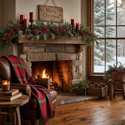
Anchor the cranberry and balsam palette in your rustic Christmas interior through the largest possible textile surfaces first — a generously scaled plaid wool throw in cranberry and forest green draped over a leather armchair, linen cushion covers in deep red against a neutral sofa, a wool rug with a traditional pattern in the two palette colors on wide plank pine flooring — before introducing the palette’s natural botanical elements in the form of fresh balsam wreaths, cranberry berry clusters, and red-berried holly branches gathered into arrangements on every horizontal surface. The fireplace mantel is the natural home of this palette’s most theatrical display, where fresh balsam branches, clusters of actual cranberries threaded on natural twine, red pillar candles of varying heights in aged iron holders, and a collection of pinecones dusted with white paint to suggest frost create a mantel composition of such complete seasonal authenticity and material richness that it looks simultaneously effortlessly natural and deeply, warmly beautiful.
2. Warm Copper and Cream
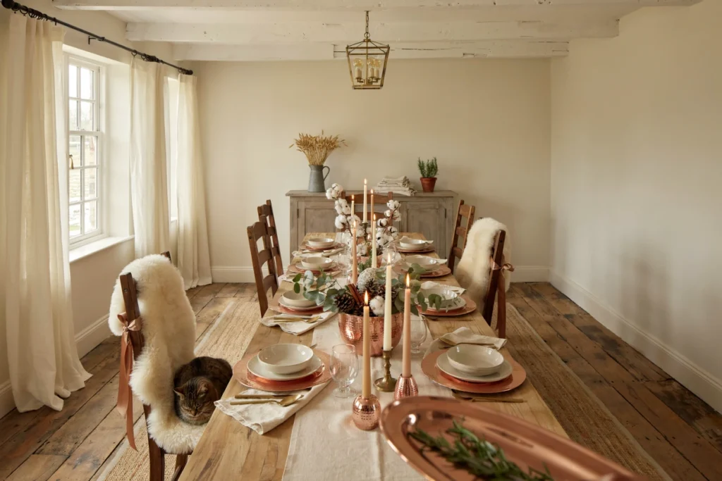
Warm copper and cream is the most sophisticated and most quietly glamorous of all the rustic Christmas color palettes for 2026, pairing the rich, honey-warm metallic glow of hammered copper with the soft, luminous neutrality of undyed cream in a combination of such refined restraint and material beauty that it elevates the rustic Christmas aesthetic from its comfortable familiarity into something genuinely chic and editorial without sacrificing an ounce of the warmth and approachability that make rustic Christmas decorating universally beloved. Copper occupies a unique position in the metallic palette of Christmas decorating — warmer and more organic than gold, richer and more complex than bronze, and entirely free of the cold, hard associations of silver — making it the most naturally rustic-appropriate metallic choice available for a holiday palette that prioritizes warmth, naturalness, and the honest beauty of aged materials.
Build the copper and cream palette throughout your rustic Christmas home by replacing conventional gold and silver Christmas metallics with copper alternatives wherever possible — copper wire fairy lights instead of gold or silver strands, hammered copper ornament balls instead of glass baubles, copper mesh ribbon instead of satin, and hand-hammered copper candlestick holders instead of manufactured metal versions. The cream element of the palette should be sourced from the warmest, most natural cream tones available rather than pure white or cool ivory — undyed natural linen, beeswax candles in their natural honey-cream tone, cream cotton stems dried at their most beautifully fluffy and round, and cream-colored dried pampas grass in its most natural, untinted state. The combination of warm copper glow and warm cream softness creates an interior Christmas atmosphere of such complete, unified warmth that the room feels genuinely golden throughout every hour of the dark December day.
3. Midnight Pine and Antique Gold
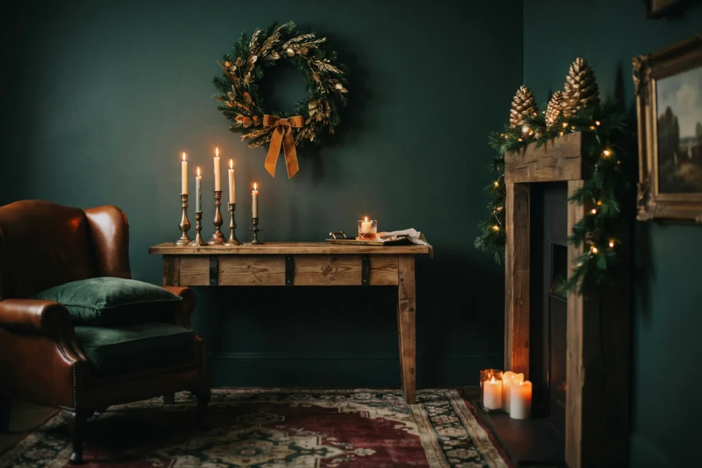
Midnight pine and antique gold is the most dramatically sophisticated and most genuinely opulent rustic Christmas color palette of the 2026 holiday season, pairing the deepest, darkest, most atmospheric shade of forest green — the near-black green of a pine forest at dusk in December, weighted with shadow and smelling of cold resin and frozen earth — with the warmly aged, slightly tarnished gold of antique metalware that has developed the beautiful depth and complexity of genuine patina through decades of use and exposure. This palette creates a Christmas interior atmosphere of such complete, enveloping richness and drama that it transforms whatever room it inhabits into a space that feels simultaneously intimate and grand — a holiday sanctuary that feels as though it could belong to a Georgian country house library or a converted medieval barn with equal conviction and equal beauty.
Achieve the midnight pine element of this palette through the most saturated, darkest available versions of forest green in every material you introduce — deep pine velvet cushions and throws, near-black green botanical wreaths with minimal foliage removed for maximum density and darkness, pine-painted accent walls or furniture pieces in the most deeply pigmented forest green available, and fresh Christmas tree and garland materials selected specifically for their darkest, most richly saturated green foliage rather than the more common bright or yellow-toned holiday green. The antique gold element must be genuinely aged in its appearance — genuinely patinated brass candlestick holders, aged gold leaf applied to pine cone ornaments, antique gold velvet ribbon with the slight pile crush of genuine vintage textile — rather than the bright, sharp yellow-gold of new metallic finishes that would introduce a jarring brightness into the palette’s deliberately rich, dark, and moody atmospheric character.
4. Birchwood White and Dove Grey
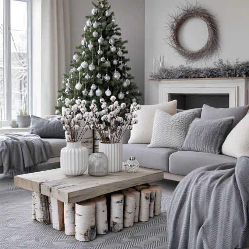
Birchwood white and dove grey is the most serenely beautiful and most Nordic-spirited rustic Christmas color palette on this list, drawing its inspiration directly from the winter landscape of the Scandinavian boreal forest where white-barked birch trees stand in silvery congregations against grey winter skies and snow-covered ground in a color composition of such pure, atmospheric beauty that it requires no embellishment or enrichment from any additional color to achieve a complete and deeply moving visual statement. This is a palette of extraordinary restraint and confidence — the willingness to build an entire Christmas interior from only two near-neutral tones, white and grey in all their natural material variations, represents a decorating philosophy of genuine conviction that the Japandi-influenced Scandinavian Christmas aesthetic of 2026 has elevated into the most influential and most widely admired rustic Christmas color direction of the season.
Introduce the birchwood white element through genuine natural materials wherever possible — actual white-barked birch logs arranged as a decorative fireplace filling or as candle pedestals, silver birch twig wreaths and garlands that preserve the natural white bark in their construction, white ceramic vessels with the slight warmth of handmade stoneware rather than the clinical brightness of machine-made porcelain, dried white cotton stems and pampas grass in their most naturally cream-white undyed state, and white beeswax candles in natural honey-cream tones. The dove grey element provides the palette’s grounding depth and quiet sophistication through grey linen upholstery and throws, grey herringbone wool area rugs, grey painted furniture pieces in aged chalk paint, and the natural silver-grey of weathered reclaimed wood surfaces that have developed their beautiful tonal depth through genuine outdoor exposure over many years.
5. Rust Orange and Sage Green
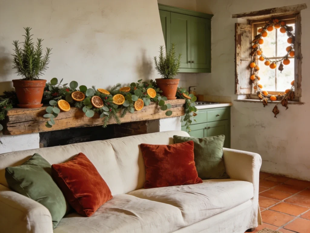
Rust orange and sage green is the most organically beautiful and most artisanally inspired rustic Christmas color palette of 2026, capturing the specific color world of a sun-warmed Mediterranean or Southwestern farmhouse kitchen in December — terracotta walls, herb garden silvery green, dried citrus garlands, and the warm amber glow of late afternoon winter sun — in a palette of such immediate, sensory warmth and genuine earthen beauty that it makes every room it inhabits feel simultaneously deeply ancient in its material roots and completely contemporary in its sophisticated color intelligence. Both rust orange and sage green are colors of the earth and the kitchen garden — rust is the color of terracotta clay, of dried poppy seed pods, of autumn oak leaves at their most oxidized — while sage is the color of the living herb bush, of lichen on stone walls, of dried lavender stems in their most silvery winter state.
Build the rust and sage palette throughout your rustic Christmas home beginning with the largest architectural surfaces — a sage green paint on a single kitchen accent wall or on painted cabinet doors provides the most impactful and most permanently beautiful introduction of the palette’s green element, while rust orange terra cotta pots, dried orange slice garlands, and rust velvet textile accents introduce the warm oxidized orange without requiring any structural change to the room. The magical quality of this particular palette combination is its capacity to make natural botanical elements look extraordinarily beautiful within it — fresh eucalyptus garlands, dried citrus slices, rosemary topiaries in terracotta pots, and olive branch wreaths all exist within the rust and sage color family so naturally that decorating with this palette feels less like a deliberate decorating exercise and more like the organic accumulation of beautiful natural things that simply belong together in the same warm, herbaceous, sun-kissed color world.
6. Plaid Red and Warm Oatmeal
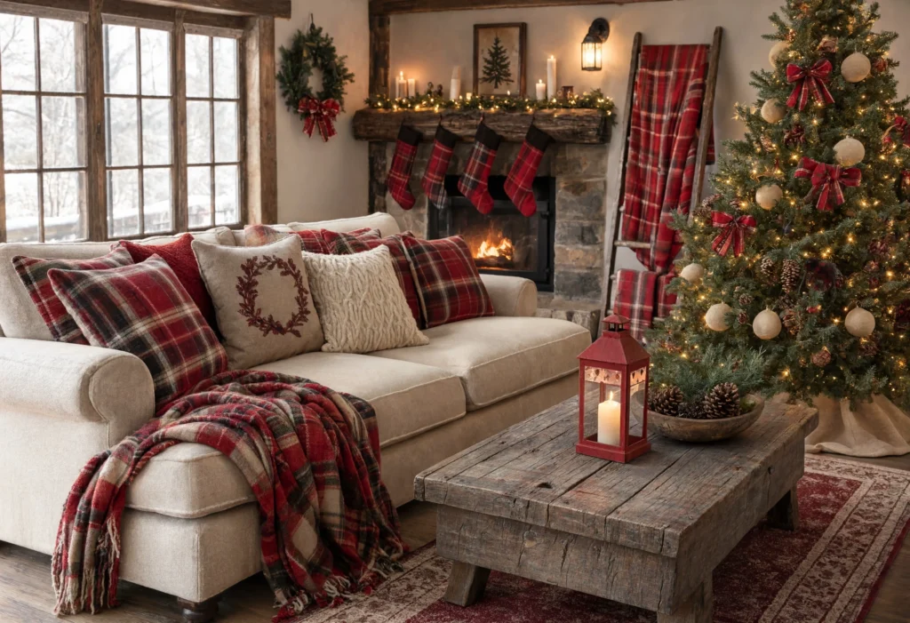
Plaid red and warm oatmeal is the most genuinely cozy and most unabashedly heartwarming rustic Christmas color palette available — a combination so thoroughly embedded in the cultural DNA of the American country Christmas that its appearance in a room triggers an almost involuntary emotional response of warmth, nostalgia, and the particular happiness of anticipating a Christmas morning surrounded by people you love in a house that smells of pine and cinnamon and fireplace smoke. The red element of this palette should be the specific, slightly blue-toned red of classic tartan plaid rather than the sharp, warm red of commercial Christmas decorating — a red that reads as deeply rich and slightly cooled, the red of wool dyed with natural cochineal rather than synthetic pigment, the red of a perfectly ripe cranberry rather than a plastic ornament.
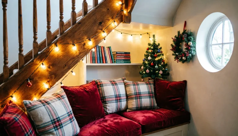
The oatmeal element of this palette is what saves it from the potentially overwhelming quality that too much red Christmas decorating can develop — the warm, slightly grey-toned oatmeal of undyed natural wool and linen provides the spacious, breathing neutral ground against which the plaid red reads with maximum richness and warmth without ever becoming visually exhausting or emotionally overwhelming. Introduce the oatmeal element through the largest textile surfaces in the room — an oatmeal linen sofa, natural wool area rug, undyed linen curtains — so that the plaid red elements including cushions, throws, ribbon on the Christmas tree, and candle lantern accents read as warm, generous highlights against the neutral ground rather than as the primary visual experience of the room. This palette rewards layering — the more textures of red plaid and natural oatmeal you combine, the richer and more authentically cozy the room becomes.
7. Forest Green and Weathered Wood
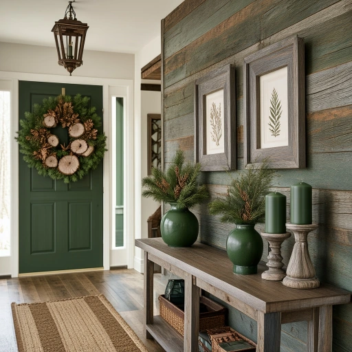
Forest green and weathered wood is the most naturally beautiful and most architecturally grounded rustic Christmas color palette on this list, pairing the living, breathing, resinous green of forest vegetation at its most deeply saturated winter state with the silver-grey, brown-toned, completely unaffected beauty of timber that has been exposed to weather, sunlight, and time until all traces of its original finish have been removed and only the pure, honest material of the wood grain itself remains — a combination that essentially reproduces the color relationship of the living winter forest itself, where dark green pine and fir foliage stands against grey tree trunks and silvered deadwood in a color composition of such complete, unselfconscious natural beauty that human decorating can only aspire to acknowledge and reflect it rather than improve upon it. This palette is the rustic Christmas color story for the home that values genuine materials above all other decorating considerations.
Introduce the weathered wood element through genuinely aged timber rather than artificially distressed reproductions wherever possible — reclaimed barn wood shelving with its beautiful silver-grey surface, driftwood pieces used as candle holders or wreath bases, vintage wooden crates with naturally worn paint surfaces, and antique wooden frames with their original weathered finish preserved rather than refinished. The forest green element should be introduced in layers of both botanical freshness and painted permanence — fresh pine and fir garlands and wreaths for the natural botanical green that also fills the room with fragrance, and forest green paint on a front door, accent wall, or furniture piece for the more saturated, deeply pigmented version of the color that anchors the palette with permanent architectural conviction rather than the temporary seasonal presence of fresh greenery.
8. Frosted Burgundy and Pewter
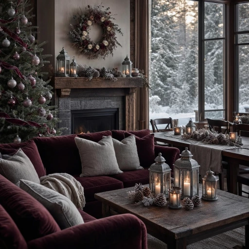
Frosted burgundy and pewter is the most unexpectedly sophisticated and most beautifully aged rustic Christmas color palette of the 2026 holiday season, combining the deep, complex richness of burgundy — the darkest, most wine-toned member of the red color family, simultaneously referencing vintage wine, dried rose petals, aged mulberries, and the deepest pomegranate seeds — with the cool, lustrous, genuinely antique quality of pewter in a pairing of such complete material and chromatic sophistication that it creates a Christmas interior atmosphere closer to the ambiance of a seventeenth-century Dutch still life painting than to the cheerful brightness of conventional holiday decorating, and is all the more beautiful and all the more distinctive for that specific art historical reference. Frosted burgundy is burgundy treated with the lightest possible dusting of silver or frost — the color of a dried rose petal, of a wine-dark plum viewed through morning frost on the window glass, of burgundy velvet that has faded very slightly at its highest surface pile.
The pewter element of this palette is its most materially specific and most crucial chromatic contribution — not silver in its bright, mirror-finish modern form, not gold in its warm, festive conventionality, but pewter in its specific dull, slightly greenish-grey, completely unpolished metal beauty that suggests age, craft, and the honest material culture of pre-industrial domestic life. Source genuine pewter objects — antique pewter candlesticks, pewter serving plates used as decorative trays, genuine pewter ornament balls with their characteristic soft, non-reflective surface — rather than silver-painted reproductions that miss the specific chromatic quality of real pewter entirely. The frosted burgundy and pewter palette is most beautifully expressed in candlelight, when the pewter surfaces absorb and softly reflect the warm flame light and the burgundy textiles glow with the deep, wine-dark richness that only true low-light illumination reveals in their most saturated tones.
9. Honey Amber and Spruce Blue-Green
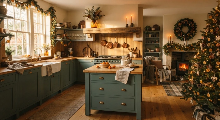
Honey amber and spruce blue-green is the most artistically original and most visually intriguing rustic Christmas color palette of 2026, pairing the warm, luminous, deeply golden amber of beeswax and autumn honey — a color that seems to hold summer sunlight in solid form — with the cool, complex, slightly blue-toned green of Colorado spruce foliage in its most silvery, most atmospheric winter state, creating a color tension between warm amber gold and cool blue-green that is simultaneously harmonious in its natural botanical authenticity and visually dynamic in its warm-cool chromatic contrast. The extraordinary quality of this palette is that both colors exist together in genuine nature — amber beeswax is produced by bees who feed on the same plants whose blue-green foliage provides the palette’s cool counterpoint — giving the combination an ecological coherence and natural authenticity that makes it feel discovered rather than invented.
The honey amber element of this palette is most powerfully expressed through light-transmitting materials that allow warm amber glow to pass through and illuminate their color from within — amber glass vessels and ornament balls, beeswax candles in their natural unbleached honey tone, amber glass hurricane lanterns holding warm candlelight, and the golden surface of genuine antique honey-toned pine wood floors that transmit warm light across their entire surface when afternoon sun strikes them at a low winter angle. The spruce blue-green element should reference the specific cool, silvery, slightly dusty version of green found in blue spruce foliage rather than the warmer, more yellow-toned greens of conventional Christmas decorating — a green that reads almost grey in certain lights and almost turquoise in others, creating a color of extraordinary visual complexity and atmospheric depth that shifts and reveals itself differently throughout the short winter day as the light changes from cold grey morning to warm amber afternoon to candlelit evening.
10. Smoke Grey and Antique Rose
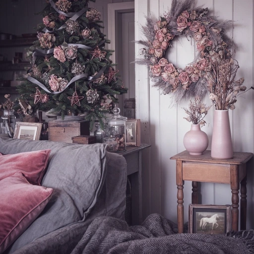
Smoke grey and antique rose is the most romantically beautiful and most genuinely feminine rustic Christmas color palette available for the 2026 holiday season, combining the cool, atmospheric, slightly purple-toned grey of wood smoke rising against a winter sky with the soft, deeply complex dusty rose of antique dried flowers — a rose that has lost its fresh petal brightness and developed instead the profound, muted, utterly beautiful color of a rose that has been pressed between the pages of a book for a hundred years and emerged more beautiful, more interesting, and more emotionally resonant than it was in its original fresh-cut state. This is the palette for the rustic Christmas interior that values beauty of a quieter, more contemplative, more deeply personal kind over the loud, declarative visual impact of more conventional holiday color combinations.
The smoke grey element of this palette should be the specific warm-toned grey that contains undertones of lavender, blue, and the faintest suggestion of purple rather than the cooler, more neutral grey of slate or concrete — a grey that reads as a color with genuine emotional content rather than a neutral background, the grey of early morning winter fog, of dried lavender stems, of wood ash from a winter fire. The antique rose element is the palette’s warmth provider, its emotional softening agent, the color that prevents the smoke grey from reading as cold or austere — introduced through dusty rose velvet cushions, dried rose ornaments and garlands, antique rose ceramic vessels, and the beautiful pale pink of dried pampas grass in its most naturally soft and dreamy state. Together these two colors create a Christmas palette of such completely unique, quietly extraordinary beauty that a room decorated in smoke grey and antique rose for the holidays becomes a genuinely distinctive personal statement rather than a reflection of any conventional Christmas decorating tradition.
11. Walnut Brown and Cream Linen
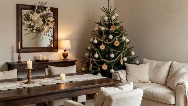
Walnut brown and cream linen is the most timelessly elegant and most materially authentic of all the neutral rustic Christmas color palettes — a combination so thoroughly grounded in the honest beauty of two of nature’s most genuinely beautiful natural materials, dark walnut timber and undyed natural linen fiber, that it achieves a level of decorative sophistication that no artificially invented color combination can match for depth, material beauty, and the specific quality of warmth that only genuinely natural materials in their most honest, least processed state can provide. Dark walnut is one of the world’s most beautiful woods in any season, but in the context of Christmas decorating its deep, complex brown — simultaneously warm and cool, simultaneously red-toned and chocolate-dark, developing further depth and beauty in the warm candlelight that December interiors require — creates a chromatic anchor of extraordinary richness that makes every cream element placed against it glow with an almost luminescent warmth.
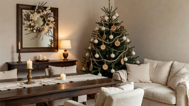
The cream linen element of this palette must be sourced from genuinely natural, minimally processed linen fiber — the specific cream of undyed European linen, slightly warm in tone, slightly irregular in surface texture, with the natural luster of the linen fiber visible in its woven surface — rather than the brighter, more synthetic cream of heavily bleached or chemically treated fabric that lacks the organic warmth and material honesty that the walnut brown and cream linen palette absolutely requires from both its chromatic partners. A Christmas tree decorated exclusively in walnut and cream — wooden disc ornaments cut from a walnut branch with the bark preserved as a natural border, cream cotton ball ornaments, natural jute twine garland in loose loops, cream beeswax taper candle clips — is the most beautiful and most materially consistent Christmas tree possible within this palette, requiring no additional color, no metallic supplement, and no manufactured ornament to achieve a level of natural Christmas tree beauty that is genuinely, quietly extraordinary.
12. Evergreen and Tarnished Silver
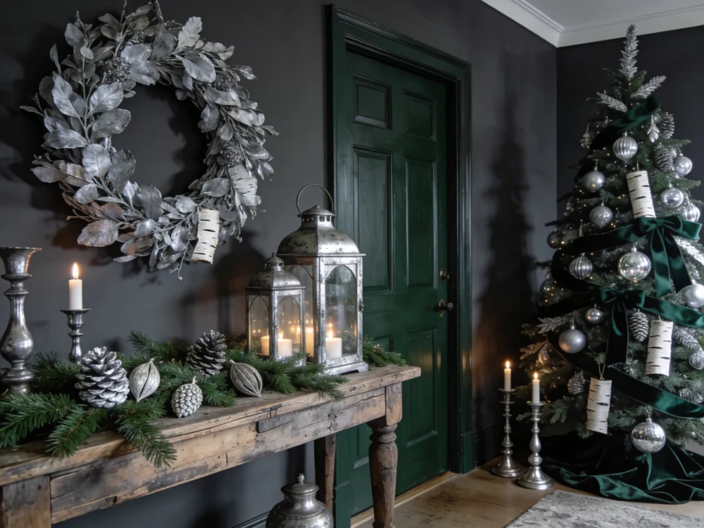
Evergreen and tarnished silver is the most dramatically moody and most atmospherically compelling rustic Christmas color palette of 2026, combining the absolute depth and richness of the darkest possible forest green — the green of old-growth evergreen forests where sunlight barely penetrates the canopy and the air is cold, resinous, and thick with the fragrance of ancient conifer foliage — with the beautiful, slightly grey, slightly green-tinged silver of genuinely tarnished metal surfaces that have developed their complex patina through years of atmospheric exposure rather than the artificially applied antiquing processes that attempt to replicate genuine tarnish but never quite achieve its specific, unpredictable, organically developed beauty. This palette creates a Christmas interior of such complete, enveloping dramatic richness that it transforms whatever room it inhabits into a space of genuinely extraordinary atmospheric power and deep, quiet beauty.
The tarnished silver element of this palette is its most chromatically complex and most materially specific contribution — a silver that is neither bright nor simply grey but instead a color of genuine complexity, containing undertones of green, blue, and the faintest warmth of aged metal, visible most beautifully in the surface of old Sheffield plate, Victorian silver that has not been polished for many years, and genuine antique pewter whose surface has developed a beautiful silver-grey patina through decades of domestic use. Collect genuine tarnished silver objects for this palette — antique tarnished silver candlestick holders from estate sales and antique markets, genuine silver-toned mercury glass ornaments with their characteristic aged surface, old silver Christmas tree ornaments with their tarnished metal clip fittings — and resist any impulse to polish or brighten them, as the tarnish is the beauty, and a freshly polished piece would introduce exactly the brightness and visual sharpness that would shatter the palette’s deliberately moody, atmospheric, and deeply beautiful character.
13. Ochre Yellow and Chocolate Brown
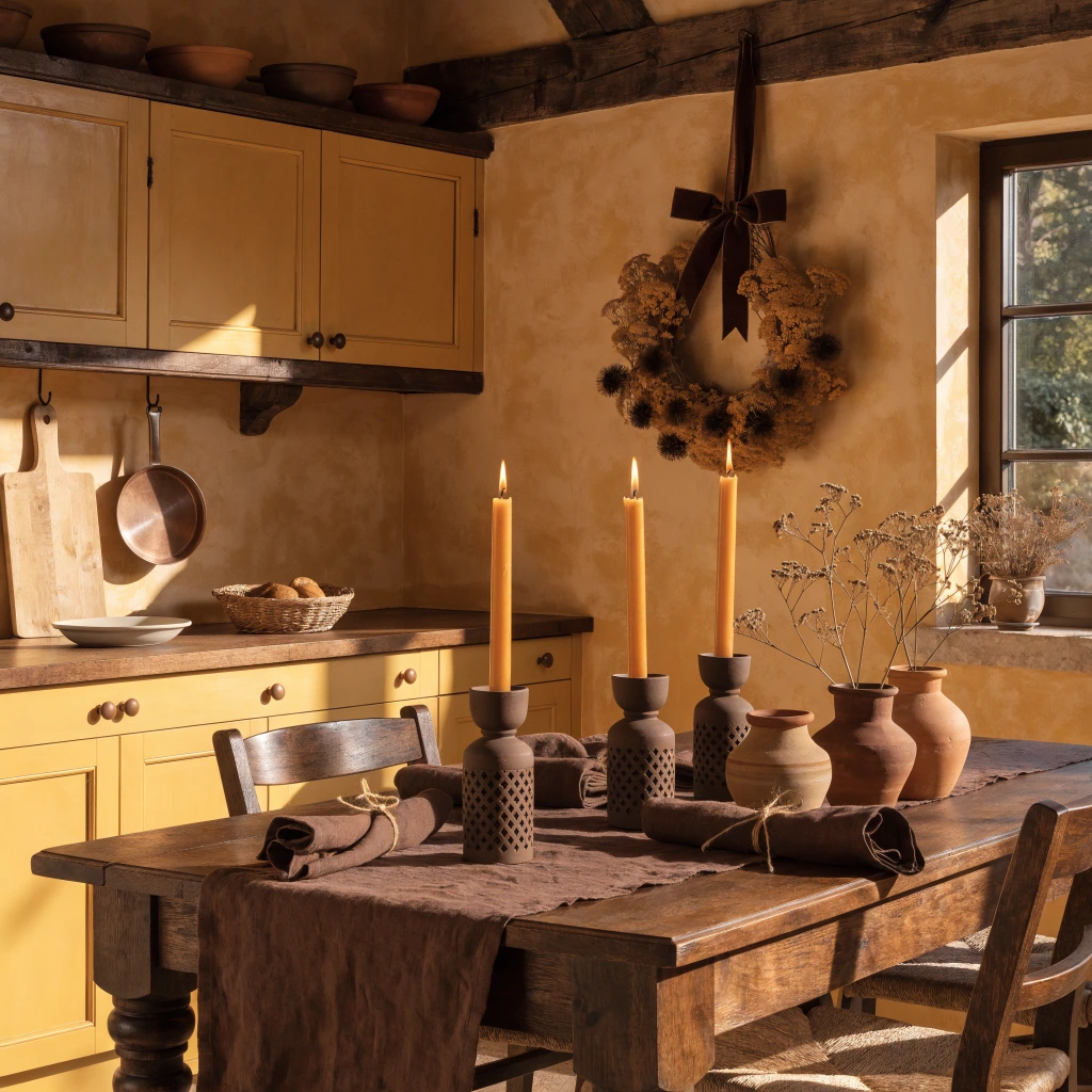
Ochre yellow and chocolate brown is the most earthily abundant and most warmly generous rustic Christmas color palette on this list, drawing its chromatic inspiration directly from the agricultural landscape of the harvest season carried forward into winter — ochre is the color of dry wheat fields, of sun-dried clay walls, of bee pollen and saffron and turmeric, the color of the earth at its most warm, mineral, and life-giving — paired with chocolate brown in the deep, complex, genuinely dark brown of good soil, aged timber, roasted cacao, and the warm interior of a freshly broken chestnut, creating a palette of such complete earthen abundance and material warmth that every room decorated in it feels simultaneously deeply rooted in the soil and generously, exuberantly alive with the warmth of gathered harvest and winter firelight. This is the palette of the farmhouse Christmas table at its most abundant, most genuinely hospitable, and most beautifully earthy.
The ochre yellow element of this palette demands the specific, complex, slightly orange-toned yellow of natural ochre mineral pigment rather than the cooler, more neutral yellow of lemon or the warmer, more synthetic yellow of commercial paint — an ancient color with thousands of years of use in painting, architecture, and decorative arts across virtually every human culture, carrying the accumulated authority and visual richness of its long history in its particular, unmistakable warmth and depth. Introduce ochre through painted wall surfaces in a warm farmhouse kitchen, through dried flower arrangements featuring ochre yarrow, dried chamomile, and preserved goldenrod, through beeswax candles in their most deeply yellow natural tone, and through ochre-glazed ceramic vessels that reference the earthenware pottery traditions of Mediterranean and folk craft cultures. The chocolate brown element grounds the palette with the reliable warmth and depth of dark timber, linen in its deepest natural dyed brown, and the beautiful dark ceramic glazes that transform simple clay forms into objects of extraordinary, soulful depth and material richness.
14. Ice Blue and Driftwood
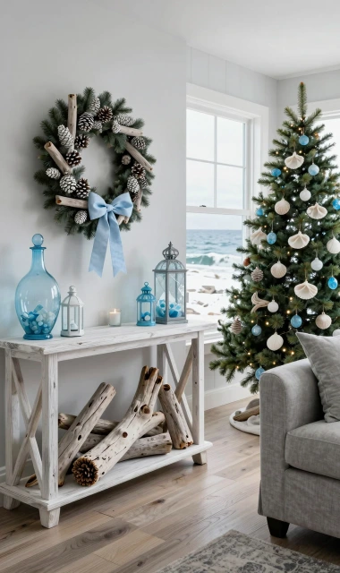
Ice blue and driftwood is the most serenely beautiful and most distinctly coastal rustic Christmas color palette available for 2026, creating a holiday interior of such complete, atmospheric calm and natural material beauty that it perfectly suits homes near the ocean, lake, or river where the winter landscape is defined not by the snow and forest of the northern inland Christmas imagination but by the grey water, bleached wood, and pale winter sky of the coastal winter in all its quiet, powerful, melancholy beauty. Ice blue is the specific blue of winter ocean water viewed on an overcast December day — not the brilliant turquoise of tropical summer seas but the deep, grey-toned, slightly green blue of cold northern waters under winter cloud cover, a color of extraordinary emotional resonance for anyone who has ever stood on a winter beach and felt the particular, clarifying combination of cold air, grey water, and the vast, indifferent beauty of the open ocean in the shortest month of the year.
Source the driftwood element of this palette from genuine beach-found or river-found driftwood pieces wherever possible — the specific grey-white, salt-bleached, water-smoothed quality of genuinely found driftwood is entirely different from the artificially bleached or painted wood that attempts to reproduce it, carrying in its particular surface texture and color variation the genuine record of its specific journey through water, sun, and time that gives it a material authenticity and natural beauty impossible to manufacture. Arrange large driftwood pieces as sculptural objects in their own right — leaning dramatically against a wall, balanced on a console table, used as a candle holder base — rather than cutting or altering them in any way that would compromise the specific beauty of their found, naturally complete form. The ice blue elements — sea glass ornaments, blue linen ribbon, pale blue ceramic vessels — provide the palette’s color notes as quiet, restrained accents that enhance rather than compete with the dominant natural material beauty of the driftwood.
15. Burgundy and Aged Brass
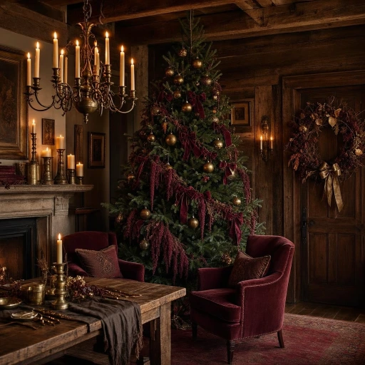
Burgundy and aged brass is the most opulently beautiful and most confidently glamorous rustic Christmas color palette of the entire 2026 holiday season, combining the deep, complex, wine-dark richness of burgundy — a color that simultaneously references vintage Bordeaux in a crystal decanter, dark damask wallpaper in a Victorian library, dried pomegranate seeds split open to reveal their jewel interior, and the deepest, most saturated dried rose petals — with the warm, complex, slightly greenish-gold beauty of genuinely aged brass that has developed its beautiful patina through years of exposure rather than the uniform brightness of new metallic finishes. Together these two materials create a Christmas interior atmosphere of such complete, layered richness and such specific historical and material depth that it conjures the imagined ideal of a grand European country house Christmas — candlelit, opulent, warm, and deeply, unhurriedly beautiful in a way that only genuine materials aged to their most beautiful state can achieve.
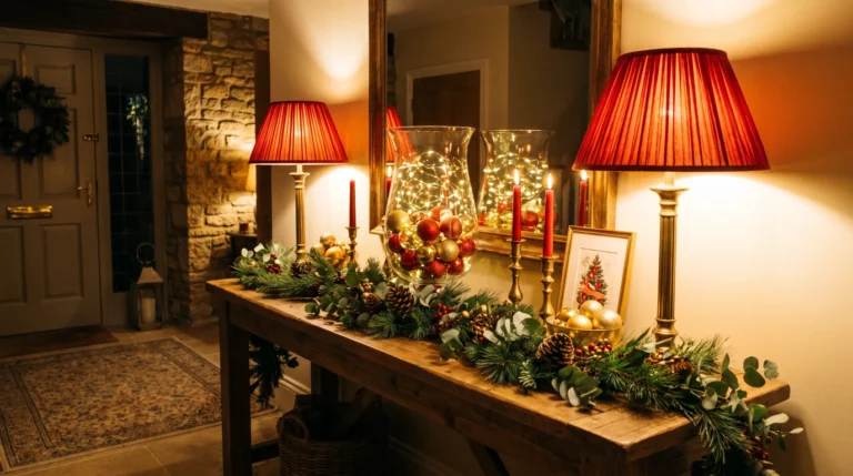
The aged brass element of this palette is its most crucial and most chromatically specific material requirement — brass in its genuinely aged state develops a color of extraordinary complexity, shifting between warm gold, olive green, and deep brown depending on the specific alloy, the age of the piece, and the conditions of its exposure, creating a metallic surface of such visual depth and organic variation that it is immediately and completely distinguishable from any manufactured imitation of aged brass at even the most casual glance. Source genuinely aged brass pieces from antique dealers, estate sales, and vintage lighting specialists rather than purchasing new brass pieces that have been artificially antiqued — the difference in visual quality and material authenticity is profound, and the aged brass pieces carry with them the accumulated beauty of genuine time and use that no manufactured patina can replicate. Pair aged brass candlestick holders, picture frames, and hardware accents with the deepest available burgundy velvet, linen, and dried botanical materials for a rustic Christmas palette of absolute, uncompromising, genuinely spectacular material richness.
16. Clove Brown and Muted Gold
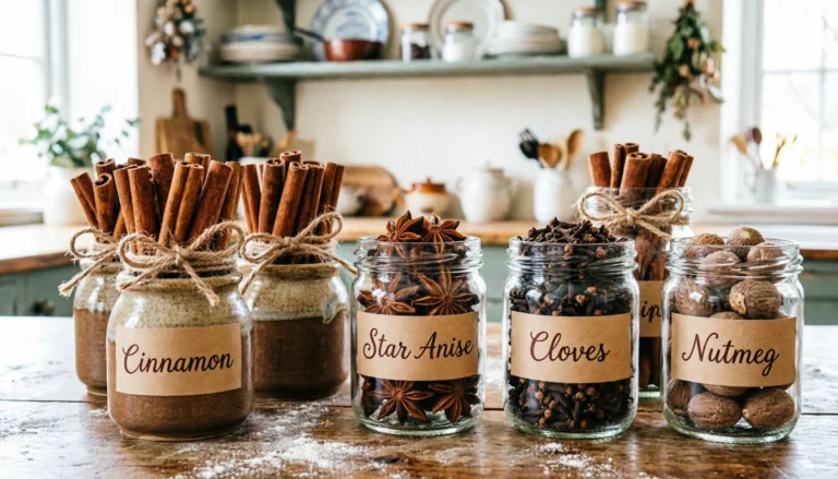
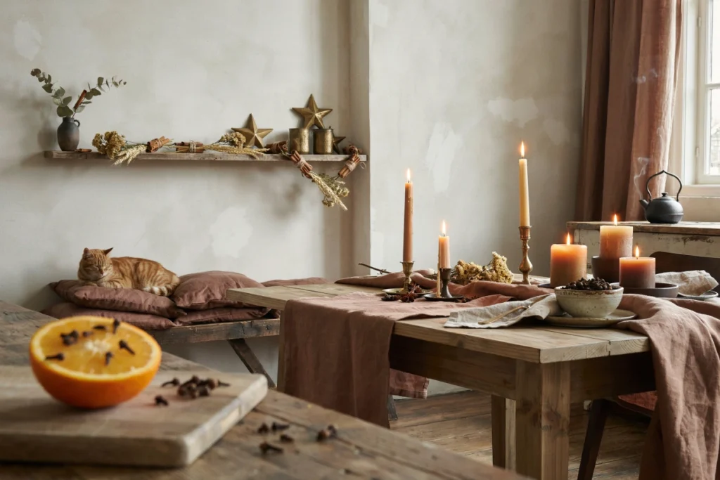
Clove brown and muted gold is the most sensorially rich and most warmly spiced rustic Christmas color palette available, creating a holiday interior that engages the sense of smell as completely as it engages the sense of sight through the use of the actual dried spices — whole cloves, cinnamon sticks, star anise, cardamom pods — that give the palette its name as genuine decorative materials woven into garlands, wreaths, and table arrangements, filling the air of every room they inhabit with the most evocative and most universally beloved fragrance of the Christmas season. Clove brown is the specific warm, dark, slightly red-toned brown of the dried clove bud itself — a brown of such depth and complexity that it reads as almost black in shadow and almost mahogany in warm light, one of the most beautiful natural brown tones available in any medium and particularly extraordinary as a dried spice arranged in decorative quantities throughout a room. Muted gold is the gold of dried wheat, of aged gilding on antique picture frames, of beeswax candles in their most deeply colored natural tone — a gold that has been softened and complexified by time and natural pigment until it reads as warm, sophisticated, and completely free of the brasher, more synthetic quality of bright manufactured gold.
Build the clove and muted gold palette by creating spice garlands using genuine whole spices threaded on strong kitchen twine — cloves pressed individually into dried orange rounds create the most beautiful and most fragrant garland material, their dark bodies creating a dense, textured surface on the orange flesh that looks as beautiful as it smells. Supplement the spice elements with dried muted gold yarrow flowers, preserved wheat stalks, and dried chamomile heads that extend the warm golden element of the palette into botanical form, creating garlands and wreaths of such complete sensory richness — warm amber color, complex spiced fragrance, extraordinary textural variety — that they function simultaneously as decoration, fragrance diffuser, and genuine work of botanical craft art that any guest encountering them for the first time will approach slowly, bend close to, and breathe in with the genuine pleasure of discovering something unexpectedly, thoroughly, and completely beautiful.
17. Lichen Green and Bark Grey
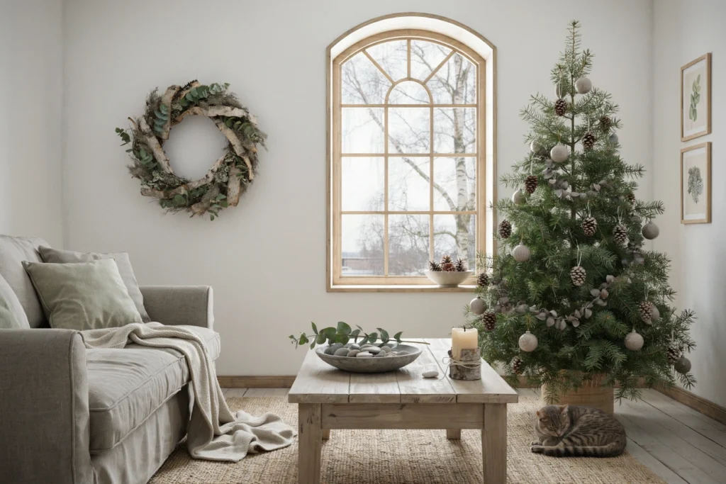
Lichen green and bark grey is the most naturalistically beautiful and most botanically authentic rustic Christmas color palette of 2026, drawing its chromatic inspiration entirely from the specific color world of the winter forest floor and the surfaces of trees and rocks in the coldest months of the year — the extraordinary grey-green of lichen growing on bark and stone, the silver-grey of weathered tree bark, the olive-grey of dried moss in winter, and the complex muted green of preserved eucalyptus foliage at its most silvery and atmospheric. Both colors exist in such perfect, inseparable natural relationship — lichen grows on bark, moss grows beside bark, grey and muted green coexist on every surface of the winter forest — that this palette feels less like a designed color combination and more like a direct quotation of the natural world’s own winter color wisdom, requiring no human invention or aesthetic judgment because nature has already made every necessary color decision with complete perfection.
This palette demands the most genuinely natural and least processed decorating materials of any palette on this list — actual lichen-covered branches gathered from woodland walks, genuine dried grey moss sourced from florist suppliers or collected sustainably from fallen logs, bark-textured ceramic objects made by potters who press actual bark into their clay surfaces before firing, and preserved eucalyptus in its most silvery, most grey-green state rather than the more yellow-toned dried eucalyptus that has lost its atmospheric color through over-drying. The beauty of the lichen green and bark grey palette is its complete self-sufficiency — a Christmas wreath made from lichen-covered branches, dried grey moss, and preserved eucalyptus with absolutely no ribbon, no ornament, and no manufactured supplement of any kind is not an unfinished decoration but a perfectly complete one, requiring nothing more than it already contains to achieve a level of natural botanical beauty that all the ribbons and baubles in the world could only diminish rather than enhance.
18. Deep Teal and Warm Tan
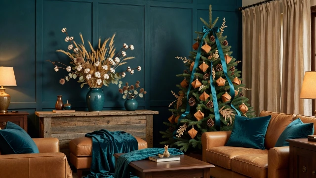
Deep teal and warm tan is the most unexpectedly sophisticated and most genuinely contemporary rustic Christmas color palette of 2026, pairing the complex, blue-green depth of deep teal — a color simultaneously referencing deep ocean water, aged verdigris copper, the blue-green of a peacock feather, and the specific greenish-blue of aged Mediterranean sea glass — with the honest, warm, unaffected beauty of natural tan leather in its most rich and naturally aged state, creating a holiday color combination of such complete chromatic originality and material sophistication that it immediately distinguishes any room decorated in it from every conventional Christmas color story while delivering a level of warmth, richness, and genuine beauty that the most traditional holiday palettes aspire to but rarely achieve with such effortless confidence. Deep teal and warm tan is the rustic Christmas palette for the home that has genuinely individual taste and the decorating confidence to express it completely without compromise.
The warm tan element of this palette is most powerfully expressed through genuine full-grain leather — the warm tan of a naturally tanned leather sofa that has developed its beautiful patina through years of use, the slightly darker caramel tan of an aged leather armchair, the warm honey tan of leather throw pillow covers in an unembellished natural grain that shows the material’s own surface beauty without concealment. The deep teal element provides the palette’s most dramatic and most visually arresting contribution — a painted board and batten wall section in the richest available deep teal, teal velvet cushions in the most deeply saturated version of the color, and a large ceramic vase in a dark teal glaze that shifts between blue, green, and grey depending on the light source — creating color moments of extraordinary depth and presence against the warm tan leather ground that make the room feel simultaneously bold and completely, deeply warm.
19. Terracotta and Sage
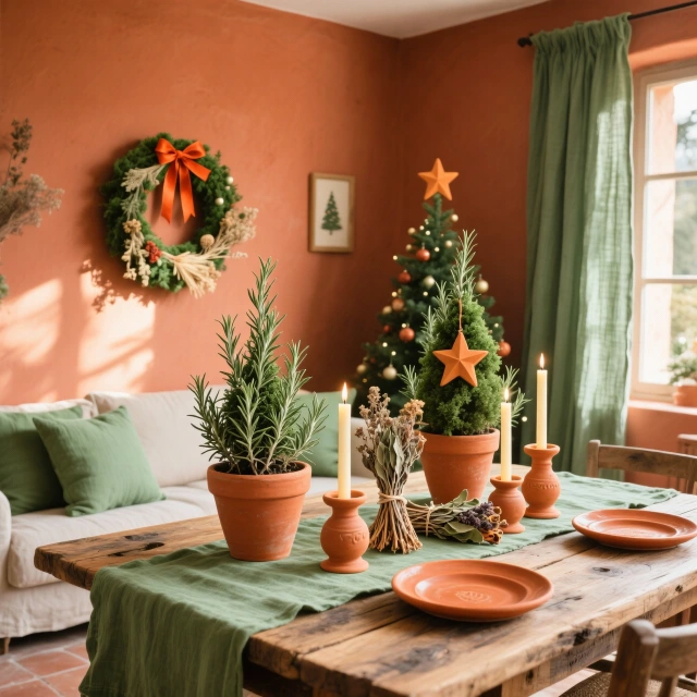
Terracotta and sage is the most warmly Mediterranean and most sun-drenched rustic Christmas color palette on this entire list, bringing the specific color world of a Provençal or Tuscan farmhouse in winter into the Christmas interior — terracotta clay walls warm with stored summer heat, sage herb bushes silver-green in the winter garden, hand-thrown clay pots, dried lavender bundles, and the specific quality of low winter Mediterranean sunlight that makes everything it touches glow with a warm, golden, ancient beauty — in a holiday color combination that feels simultaneously completely seasonal and completely free of the conventional Northern European Christmas color associations that dominate most holiday decorating traditions. This palette celebrates the Mediterranean Christmas, the Southern European and North African holiday experience of winter in a climate where the earth remains visible beneath occasional frost, where herb gardens remain partially green, and where terracotta clay architecture absorbs and radiates heat in colors that warm the eye even when the air is cold.
The terracotta element of this palette should reference the specific warm, slightly orange-toned red-brown of hand-thrown clay pottery before and after firing — not the brighter, more artificial terracotta of commercially produced decorative items but the genuine, slightly varied, completely natural color of clay that has been turned on a wheel, allowed to dry in the sun, and fired in a wood-burning kiln until it develops the deep, complex, warm color that has made Mediterranean terracotta pottery one of the world’s most beloved and most visually beautiful craft traditions for over four thousand years of continuous human making and use. Introduce the sage element through genuine growing sage plants in terracotta pots — their silvery green aromatic leaves filling the air with the most authentic Mediterranean herbal fragrance — alongside dried sage bundles, sage green linen textiles, and sage painted furniture pieces that reference the specific cool, grey-toned, slightly dusty sage green of the living herb plant in its most beautifully observed and most honestly reproduced color state.
20. Indigo Blue and Raw Hemp
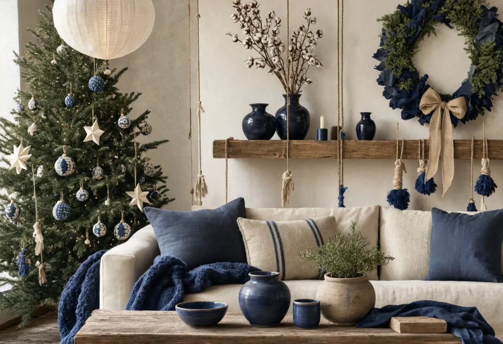
Indigo blue and raw hemp is the most artisanally beautiful and most craft-authentically rooted rustic Christmas color palette available for the 2026 holiday season, pairing the ancient, complex, endlessly fascinating blue of natural indigo dye — the blue of Japanese shibori textiles, of Tuareg robes, of antique denim worn to the exact right degree of faded complexity, of deep ocean water viewed at the horizon — with the warm, natural, unbleached, and completely honest beauty of raw hemp fiber in its most undyed and unprocessed natural state, creating a holiday color palette of such complete material integrity and cultural depth that every element within it tells an authentic story of human craft, natural dye, and the timeless beauty of plant-based fiber in its most honest form. Natural indigo and raw hemp are among the oldest continuously used natural materials in human textile history — indigo has been used as a dye for over six thousand years, hemp fiber for even longer — and their combination in a Christmas palette creates a holiday decoration story of genuinely extraordinary cultural and material depth.
The indigo blue element of this palette must be genuinely plant-derived natural indigo rather than the synthetic indigo that replaced it in industrial textile production — natural indigo produces a specific depth and complexity of blue that synthetic indigo cannot replicate, shifting between deep midnight navy and warm medium blue depending on the number of dye bath immersions, the specific mordanting process, and the fiber being dyed, creating a blue of living, organic variation that makes every piece of naturally dyed indigo textile uniquely beautiful and individually distinct from every other piece dyed in the same pot. Source naturally indigo-dyed textiles from specialist natural dye studios, Japanese textile importers, or artisan textile makers who are actively working in the natural indigo tradition, using these pieces as cushion covers, ornament wraps, and table runners that introduce the palette’s extraordinary blue element through objects of genuine craft provenance and cultural authenticity.
21. Charcoal and Cream with Cedar Accents
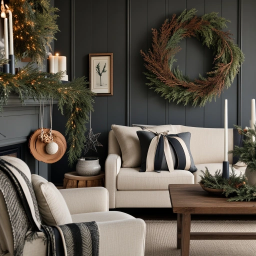
Charcoal and cream with cedar accents is the most architecturally sophisticated and most design-forward rustic Christmas color palette of 2026, creating a holiday interior of such complete graphic confidence and material sophistication that it sits equally comfortably in a converted industrial loft, a contemporary farmhouse, and a traditional country cottage without any sense of aesthetic incongruity — the palette’s combination of charcoal depth, cream warmth, and cedar natural material beauty is so fundamentally rooted in honest natural materials that it transcends any single architectural style to create a completely universal rustic Christmas aesthetic of extraordinary contemporary relevance and permanent decorative beauty. Charcoal is the most dramatically architectural neutral available to the Christmas decorator — darker and more atmospherically complex than grey, warmer and less severe than black, it provides a wall and textile backdrop of such complete chromatic depth that every cream and cedar element placed against it glows with maximum luminosity and material beauty.
The cedar accent element of this palette is its most sensory-rich contribution — fresh cedar in December releases one of the most extraordinarily beautiful natural fragrances available, a clean, warm, slightly camphoraceous, deeply forest-rooted scent that fills a room with the specific quality of a winter woodland at night in a way that no manufactured fragrance can replicate with any degree of accuracy or comparable emotional power. Use fresh cedar branches in every possible decorating application — fresh cedar garlands on mantels and staircases, cedar branches tucked into vases and arrangements, cedar sprigs woven into wreath constructions — so that the visual charcoal and cream color palette is accompanied throughout by the cedar fragrance that makes this particular palette combination a complete, multi-sensory Christmas experience rather than merely a beautiful visual arrangement of colors and materials in a room.
22. Dusty Rose and Warm White
Dusty rose and warm white is the most romantically beautiful and most genuinely dreamy rustic Christmas color palette available, creating a holiday interior of such soft, luminous, completely enveloping beauty and feminine warmth that it transforms every room it inhabits into a space of almost fairytale loveliness — not the sharp, bright pink of commercial Valentine’s Day decorating but the deeply complex, slightly grey-toned, muted and aged rose of dried flowers and faded vintage textiles, a pink that has the wisdom and the beauty of something that has bloomed, dried, and arrived at a more profound and more interesting version of itself through the natural process of aging and fading. Dusty rose is the pink of the most beautiful dried roses, of antique chintz fabric viewed in afternoon light, of a watercolor wash thinned with too much water to reveal the white paper beneath — a color of extraordinary softness and depth that becomes more beautiful and more emotionally resonant the more carefully you observe it.
The warm white element of this palette is the essential canvas against which the dusty rose achieves its full, luminous beauty — not a cold, bright white that would create jarring contrast with the soft, warm-toned rose, but the specific warm white of undyed natural linen, of beeswax candles in cream, of white cotton dried botanical stems, of white ceramic vessels with the slight warmth of handmade stoneware — a white that contains enough warmth and enough material texture to read as a genuine color partner to the dusty rose rather than a neutral background against which the rose simply floats without visual relationship. A Christmas tree decorated in dusty rose dried flowers, cream cotton ornaments, pale rose gold wire stars, and dried pampas grass in its most naturally blush-toned state is arguably the most romantically beautiful Christmas tree decoration achievable within any color palette — a botanical installation of such soft, fragrant, textural abundance that it transforms the conventional Christmas tree format into something closer to a floating winter garden of dried flowers and natural grasses than a conventionally decorated holiday tree.
23. Black Walnut and Beeswax
Black walnut and beeswax is the most dramatically beautiful and most atmospherically extraordinary rustic Christmas color palette on this entire list — a near-monochromatic palette of such complete tonal confidence and such absolute commitment to the warmth of natural candlelight as the primary illuminating force that it creates a Christmas interior experience unlike anything achievable through any other color combination or any other decorating approach on this list. The near-black surface of dark walnut timber — its color so deep and complex that it reads as almost black in low light and reveals its full, rich, red-brown depth only in the specific warmth of candlelight — creates the most dramatically dark and atmospherically powerful background imaginable for the warm, honey-amber glow of natural beeswax candles, producing a light-and-shadow drama of such extraordinary beauty that the room decorated in this palette by candlelight becomes a genuinely transcendent sensory experience that no photograph can fully capture and no description can adequately convey.
Create the black walnut and beeswax Christmas interior by beginning with the darkest possible walnut surfaces — a near-black walnut dining table, dark walnut wide plank floors in their most deeply patinated state, black walnut picture frames and mirror frames, dark walnut shelving and console tables — and filling every horizontal surface with groupings of beeswax candles at dramatically varying heights. Use only beeswax candles throughout the entire room — no paraffin, no soy, no artificially scented alternatives — so that the specific honey-sweet fragrance of burning natural beeswax fills the room as completely as the warm amber light of the beeswax flames fills the visual field of the dark walnut interior, creating a sensory environment of such complete, unified, natural beauty that every person who enters the room by candlelight on a December evening experiences the specific quality of awe that the most genuinely beautiful things in the world reliably produce in every human being fortunate enough to encounter them.