18 Modern Barndominium Kitchen Ideas That Look Stunning
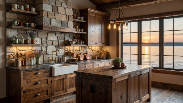
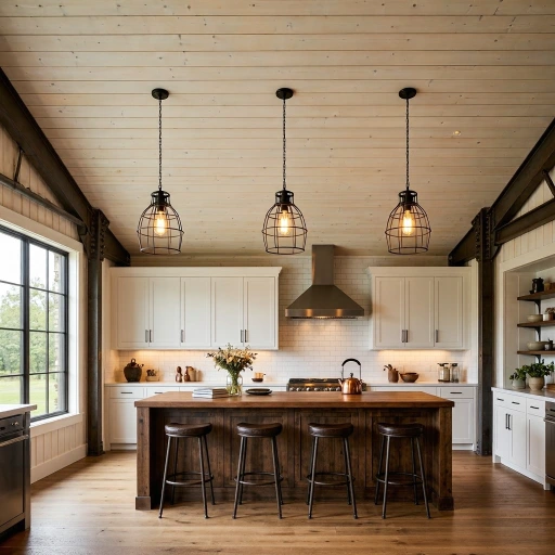
1. Exposed Steel Beam Ceiling with White Shaker Cabinets
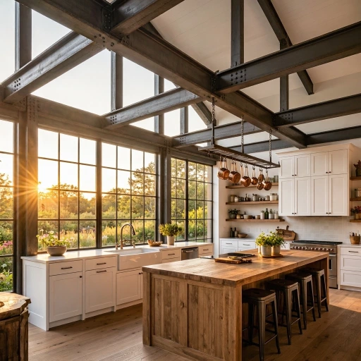
Exposed steel beam ceilings paired with crisp white shaker cabinets is the barndominium kitchen combination that most perfectly and most authentically captures the specific design identity of the barndominium form itself — the honest expression of the building’s steel structural system above meeting the warmth and craftsmanship of traditional painted cabinet construction below, creating a kitchen that is simultaneously industrial in its structural honesty and domestically warm in its cabinetry character. The exposed steel beams carry within their blackened mill scale surfaces the complete story of the barndominium’s construction heritage — the precision-engineered structural members of a metal building system revealed and celebrated rather than concealed behind drywall, their specific visual weight and engineering clarity communicating the building’s genuine structural identity with an honesty that conventional residential construction consistently and unnecessarily obscures. The white shaker cabinetry provides the domestic warmth and craft reference that grounds the kitchen’s industrial structural expression in the familiar, human-scaled language of traditional American kitchen design.
Preserve the steel beams’ original mill scale surface rather than applying paint or a clear coat finish that would alter their specific dark, slightly iridescent grey-black character — the mill scale’s natural surface being simultaneously the most authentic and the most visually beautiful treatment for structural steel in an exposed interior application. Treat the beams with a penetrating clear wax or a specialized rust inhibitor product that stabilizes the mill scale without changing its visual character, preventing active rust progression while maintaining the surface’s honest material identity. Specify the shaker cabinets in a true bright white rather than an off-white or cream — the contrast between the bright white cabinet fronts and the dark steel beams above creating the most visually dramatic and most spatially dynamic kitchen composition available in the barndominium context, where the ceiling height and the structural scale of the beams demand a cabinet treatment with sufficient visual presence to anchor the composition at the human scale of daily kitchen use. Complete the kitchen with a farmhouse sink, black steel window frames, natural wood floating shelves, and brass or black hardware for the complete material vocabulary of the barndominium’s industrial-farmhouse aesthetic fusion.
2. Concrete Countertops with Black Steel Open Shelving
Custom grey concrete countertops paired with black powder-coated steel open shelving is the barndominium kitchen material combination that most directly and most honestly expresses the raw, industrial material character of the barndominium structure through the kitchen’s two most visible horizontal and vertical surface systems — the concrete countertop carrying the weight, permanence, and handmade variation of genuinely cast material, and the black steel shelving referencing the building’s structural steel vocabulary at the human scale of kitchen storage and display. Concrete and steel are the barndominium’s two most architecturally authentic materials — the structural steel of the building’s frame and the cast concrete of its floor slab appearing above ground in the kitchen’s most functional surfaces, creating a material continuity between the building’s construction and its kitchen’s finish specification that gives the space a coherent, honest identity that individually selected finish materials cannot replicate. The kitchen that uses the building’s own materials as its finish specification is the barndominium kitchen most genuinely in dialogue with its structural context.
Pour the concrete countertops on site rather than as factory-cast units — the site-poured concrete developing the specific character of its particular casting conditions, including the natural variations in aggregate distribution, the slight irregularities of a hand-finished surface, and the unique patina of a pour that was shaped by the specific temperature, humidity, and skilled attention of a specific craftsperson on a specific day in the barndominium’s construction. Install the black steel open shelving on a dedicated section of wall that receives sufficient natural light to make the displayed ceramics, plants, and kitchen objects visible and beautiful against the dark steel — avoiding positions in deep shadow where the shelving’s displayed contents would be lost in the darkness rather than presented against the steel’s dark backdrop with the deliberate clarity of objects in a lit display. Source Edison bulb pendant lights with a genuine hand-blown glass globe rather than machine-produced approximations — the slight irregularity of hand-blown glass creating the warm, slightly distorted light quality that makes industrial Edison bulb lighting most atmospheric and most genuine in a barndominium context where authentic materials at every scale communicate the design’s commitment to honest material expression.
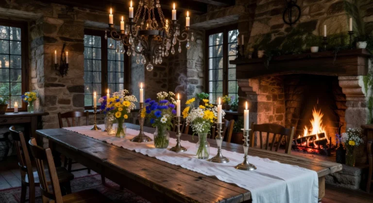
3. Sliding Barn Door Pantry with Shiplap Walls
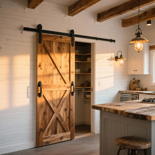
A sliding barn door concealing a walk-in pantry — the door’s natural wood grain and black iron hardware creating the most immediately recognizable and most authentically agricultural of all barndominium interior design moments — set within a wall of white-painted shiplap paneling that wraps the kitchen’s primary wall surfaces in the warm, horizontal-lined texture of traditional timber-clad construction, is the barndominium kitchen design idea that most completely and most joyfully celebrates the design’s rural agricultural heritage through a combination of functional door hardware and wall surface material that together create the kitchen’s most characterful and most photographically beloved architectural feature. The sliding barn door carries an extraordinary cultural and historical weight within the barndominium design vocabulary — its very presence invoking the entire tradition of American agricultural architecture whose timber-framed barns, sliding hay door hardware, and hand-crafted utilitarian beauty provide the barndominium with its most emotionally resonant design reference.
Source the sliding barn door from a specialist reclaimed timber supplier — selecting a board-and-batten or tongue-and-groove door constructed from genuine reclaimed barn timber whose weathering, previous paint layers, and natural aging create the specific surface character of an object with genuine agricultural history rather than a new timber door artificially distressed to approximate age. The reclaimed door’s authentic patina — its grey surface tones, its nail holes and repair patches, its faded paint traces — communicates a connection to genuine rural American material culture that no new timber, however carefully distressed, can replicate with the same visual honesty and the same emotional resonance. Specify the black iron barn door hardware in a genuine hand-forged quality — the strap hinges, the rolling track bracket, the door pull, and the floor guide all fabricated from solid black iron by a working blacksmith whose hammer marks and organic surface variation communicate the hand-making process that distinguishes genuinely forged ironwork from the cast or stamped metal hardware that imitates its appearance while lacking its material character and its craft authenticity. Install the white shiplap on the surrounding kitchen walls at a horizontal lap of approximately 150 millimeters — the specific board dimension that creates the most balanced rhythm of horizontal lines at kitchen wall scale, visible enough to be decoratively interesting without being so prominent that the horizontal emphasis overwhelms the vertical elements of the kitchen composition.
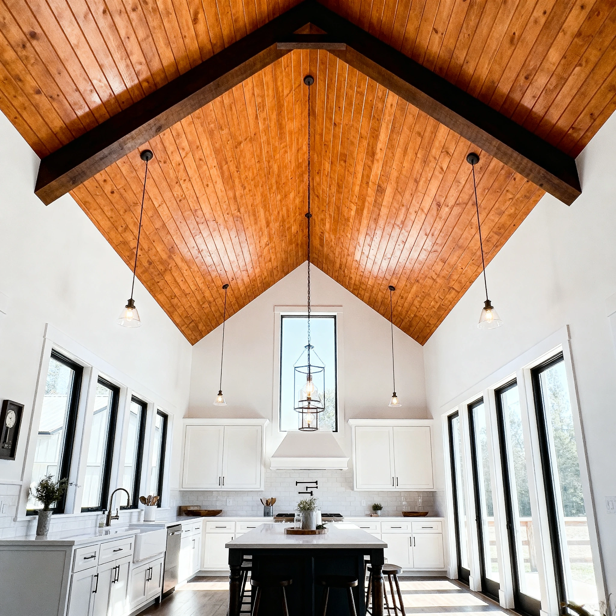
4. Vaulted Ceiling with Wood-Paneled Peak

A vaulted ceiling whose upper peak section is paneled in natural warm-toned timber — the wood paneling applied to the specific triangular area above the spring line of the vault where the ceiling’s slope creates the most visually prominent and most architecturally significant zone of the kitchen’s overhead composition — creates the barndominium kitchen’s most dramatic and most architecturally distinctive spatial feature, using the barndominium structure’s inherent generosity of ceiling height to create a kitchen that feels genuinely monumental in its vertical scale while maintaining the warmth and domestic humanity of natural timber cladding at the ceiling’s highest and most visually commanding point. The barndominium’s structural form — the metal portal frame whose pitched roof profile creates a naturally vaulted interior ceiling when left exposed — provides the kitchen designer with the most valuable architectural gift available in any residential building type: the genuinely soaring ceiling that transforms the cooking and gathering activity below from the confined experience of a standard-height domestic kitchen into the expansive, light-filled experience of a room whose vertical dimension communicates abundance, generosity, and the specific quality of dwelling in a structure whose scale exceeds the minimum required for shelter.
Apply the timber ceiling paneling in a warm-toned species whose grain and color create the maximum visual contrast with the white-painted lower wall and cabinet surfaces — American white oak with its warm golden tone and fine, straight grain, Douglas fir with its richer, redder warmth and more dramatic grain figure, or tongue-and-groove pine with its casual, cabin-like character all providing effective solutions at different price points and aesthetic registers. Install the timber paneling in a running board direction parallel to the ridge — boards running horizontally from gable to gable creating a warm, sheltering ceiling texture whose horizontal emphasis is most visually comfortable and most architecturally appropriate for the kitchen’s primary spatial orientation. Position pendant lights on long suspension cables that hang from the timber-paneled peak at dramatically varied heights — the longest cables dropping to approximately 600 millimeters above the island countertop for the most intimate relationship between the pendant light and the work surface below, and the shortest cables hanging at 1.5 to 2 meters below the ridge for the dramatic vertical element that emphasizes rather than diminishes the ceiling’s extraordinary height.
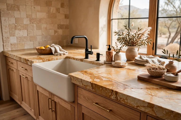
5. Farmhouse Apron Sink with Vintage-Style Faucet
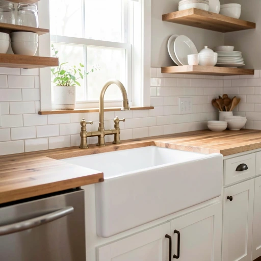
A large white fireclay farmhouse apron sink set into a butcher block countertop — its exposed front face visible above the cabinet door below, its deep basin accommodating the largest pots and most demanding kitchen tasks, and its vintage-style brass bridge faucet providing the specific combination of hand-crafted historical reference and genuine functional quality that distinguishes a faucet chosen for its beauty and its cultural connection to agricultural domestic tradition rather than its technology specification and price point — is the barndominium kitchen design idea that most singularly and most immediately communicates the kitchen’s farmhouse character through a single fixture whose proportions, material, and design heritage are inseparably associated with the American agricultural domestic interior that the barndominium form most authentically inhabits. The farmhouse apron sink is not merely a functional kitchen fixture in the barndominium context but a genuine cultural artifact whose specific form and material carry the entire history of practical rural American domestic life within their simple, unpretentious, and genuinely beautiful design.
Specify the farmhouse sink in a genuine fireclay construction — the high-temperature kiln-fired ceramic material whose specific density, weight, and surface hardness distinguish it fundamentally from the pressed steel and cast acrylic alternatives that approximate its visual appearance while lacking its material quality, its acoustic deadness when dishes make contact with its surface, and its inherent resistance to staining, chipping, and the daily physical impacts of intensive kitchen use. Source the bridge faucet in genuine unlacquered brass rather than the lacquered brass or brass-finished alternatives — the unlacquered surface developing the specific living patina of genuine aging brass whose gradual darkening and softening toward the rich, golden-brown of aged brass creates a surface that becomes more beautiful and more characterful over years of daily use rather than maintaining the uniform, static surface quality of a lacquered or coated alternative. Install the farmhouse sink with the apron face set proud of the adjacent cabinet faces by approximately five to eight millimeters — the slight projection of the apron face beyond the cabinet plane creating the most authentic farmhouse sink detail that properly positions the sink as a genuine working agricultural fixture rather than a decorative element flush-mounted in the manner of a contemporary undermount sink.
6. Mixed Metal Accents — Brass and Black
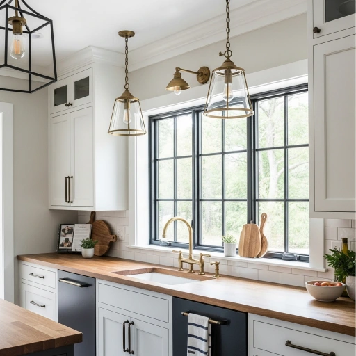
A deliberate mixed metal scheme — matte black cabinet hardware on the lower cabinet run, unlacquered brass faucets and light fixtures above, black steel window frames and pendant light cages throughout, and brass bar pulls on the upper cabinets — is the barndominium kitchen design idea that most sophisticatedly and most currently uses the metallic accent language of the kitchen’s hardware and fixtures to create a layered, warm, visually complex metallic story that reads as more genuinely designed and more personally considered than the conventional single-metal specification approach that assigns one metallic finish to every hardware piece in the kitchen from cabinet handle to faucet to light fixture without the visual interest and material variety that thoughtful mixed metal specification consistently creates. The mixed metal kitchen is the barndominium’s most contemporary material interpretation — its combination of the warm gold of unlacquered brass and the cool dark of matte black referencing the barndominium’s own material combination of warm timber and dark structural steel at the scale of the kitchen’s individual fixtures and hardware.
Establish a clear visual logic for the metal distribution that makes the mixed specification feel deliberate and designed rather than inconsistent or accidental — assigning the brass to all fixtures and hardware that are elevated above the countertop level and the matte black to all hardware at or below the countertop level, for example, creates a compositional rule whose consistency makes the mixed specification read as intentional and architecturally motivated rather than simply the result of purchasing decisions made without coordination. This elevation-based distribution logic has a genuine spatial justification — the brass’s warm reflectivity most beautifully catching the overhead and window light that illuminates the upper kitchen zone, while the matte black’s non-reflective darkness most appropriately recedes into the lower kitchen’s shadow zone where the cabinet hardware serves a purely functional role without needing the visual animation that the light-catching brass provides in the better-illuminated upper zone. Source the unlacquered brass hardware from a single manufacturer to ensure color batch consistency — the specific red-gold tone of unlacquered brass varying significantly between different alloy compositions and surface treatments, and the visual inconsistency of slightly different brass tones across a kitchen’s complete hardware program being immediately apparent and aesthetically undermining in an installed context where adjacent pieces can be compared directly.
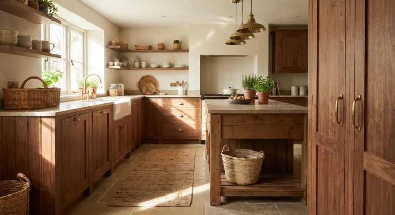
7. Large Format Island with Butcher Block Top
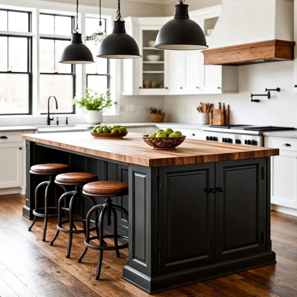
An oversized kitchen island with a thick edge-grain butcher block countertop — its generous dimensions providing the primary meal preparation surface, the casual dining counter, and the social gathering point simultaneously within the barndominium kitchen’s characteristically large, open floor plan — is the barndominium kitchen design idea that most practically and most aesthetically serves the specific functional requirements of the building’s open-plan format by providing the large, flexible, centrally positioned work and social surface that the barndominium’s generous floor plan most naturally accommodates and that the active, family-centered rural lifestyle that most barndominium residents pursue most genuinely requires. The butcher block top is the material choice that most authentically and most warmly connects the kitchen island to the barndominium’s agricultural heritage — the cutting surface that has been used in farm kitchens, butcher shops, and rural homestead cooking for centuries, its natural wood grain and its acceptance of the marks, scars, and patina of continuous cooking use creating a surface that becomes more beautiful and more characterful with every year of intensive daily use.
Specify the butcher block in a genuine edge-grain construction — individual timber boards glued together with their edge grain faces exposed on the top surface — rather than the face-grain or end-grain alternatives, for the specific combination of durability, cutting surface quality, and aesthetic character that edge-grain butcher block provides at a price point below the more expensive end-grain construction. Choose hard maple as the timber species — its tight, consistent grain, its natural resistance to bacteria, and its specific hardness providing the optimal surface for both food preparation and the daily mechanical impacts of kitchen use. Specify the butcher block at a minimum thickness of four inches — the substantial thickness that gives the butcher block its characteristic visual weight and physical presence, communicating the quality of a genuine working surface rather than a decorative wood veneer applied to a substrate. Finish with a food-safe mineral oil applied to a fully dry surface — working the oil into the wood with a clean cloth and allowing complete absorption before wiping away the excess — for the specific warm, slightly translucent surface finish that enhances the maple’s natural color and grain while providing the moisture resistance essential for a food preparation surface exposed to the inevitable water, oil, and acidic spills of intensive daily cooking activity.
8. Tongue-and-Groove Ceiling with Industrial Lighting
A tongue-and-groove timber plank ceiling in a soft warm white — its horizontal board joints creating the gentle rhythm of repeated lines overhead that transforms the barndominium’s flat ceiling plane into a surface of warm, domestic texture — paired with industrial-style cage pendant lights hanging in a deliberate row above the island is the barndominium kitchen design idea that most warmly and most completely resolves the visual coldness that a bare metal or drywall ceiling can create in a kitchen whose wall and floor surfaces are already introducing sufficient industrial material references without needing the ceiling to reinforce the aesthetic further. The tongue-and-groove ceiling brings the warmth, the scale, and the craft reference of traditional timber construction to the one surface that most powerfully affects the kitchen’s ambient atmosphere — the ceiling whose color, texture, and surface treatment determine the quality of reflected light that fills the room from above and whose character above the eye line most directly influences the psychological experience of the space as warm or cool, intimate or institutional, handcrafted or mechanically produced.
Paint the tongue-and-groove ceiling in a warm white with a subtle cream or yellow undertone rather than a pure, cool white — the warm undertone preventing the painted timber ceiling from reading as clinical or cold in a kitchen where the primary light sources are warm-toned LED fixtures rather than the neutral daylight that a cool white ceiling reflects most flatteringly. The specific warm white that most sympathetically complements the barndominium kitchen’s material palette — its structural steel, its timber accents, and its warm-toned stone or concrete surfaces — is the white that adds warmth without adding visible color, sitting at the warm edge of the white paint range without crossing into the ivory or cream territory where the ceiling’s color becomes independently visible rather than simply contributing warmth to the room’s overall ambient light quality. Install the industrial cage pendants on a continuous electrical track above the island rather than on individual ceiling canopies — the track installation allowing the pendant positions to be adjusted along the island’s length as the furniture arrangement evolves, and the continuous track creating a clean, linear electrical infrastructure that references the barndominium’s industrial building systems vocabulary more honestly than individual ceiling canopies.
9. Floor-to-Ceiling Windows on One Wall
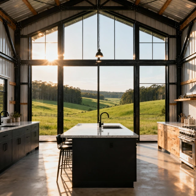
A complete wall of floor-to-ceiling steel-framed windows in the barndominium kitchen — the entire rear or side wall of the kitchen volume replaced with a structural glazing system that extends from the finished floor level to the roof’s spring line, offering the complete, uninterrupted view of the surrounding rural landscape that the barndominium’s countryside location most uniquely and most generously provides — is the barndominium kitchen design idea that most dramatically and most distinctively differentiates the barndominium kitchen experience from any urban or suburban residential kitchen by connecting the cooking activity directly and continuously with the agricultural landscape that surrounds the building and provides the fundamental context of meaning for the barndominium form’s entire cultural and aesthetic identity. The floor-to-ceiling window wall turns the barndominium kitchen from a room that happens to be in the countryside into a room that is fundamentally of the countryside — a cooking and gathering space whose every moment is enriched by the visual presence of the specific rural landscape that the kitchen’s occupants chose when they chose the barndominium life.
Specify the window wall’s steel frames in a blackened or dark grey powder coat — the dark frame color creating the most dramatic and most architecturally refined contrast between the structural steel of the window system and the bright, open view of the landscape beyond, and referencing the barndominium’s structural steel vocabulary at the window’s detail scale. Design the window wall with opening sections — either pivot windows, awning windows, or lift-and-slide doors — positioned to create cross ventilation through the kitchen during the warm months when the barndominium’s metal roof and south-facing glazing can create significant heat accumulation in the kitchen zone. Position the kitchen island to face the window wall directly — orienting the cook’s primary working position toward the landscape view for the specific quality of daily pleasure that the window wall most generously provides to the person spending the most time in the kitchen, rather than facing the cook toward an interior wall whose view, however well-designed, cannot compete with the living countryside landscape that the floor-to-ceiling window wall makes continuously, abundantly, and freely available.
10. Floating Wooden Shelves Instead of Upper Cabinets
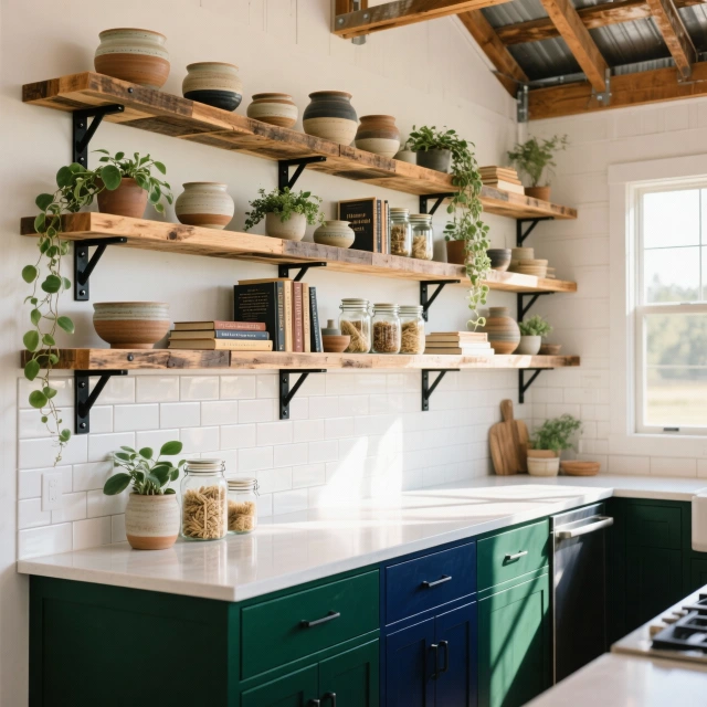
Floating wooden shelves on blackened steel brackets replacing the upper cabinets on one wall — their reclaimed timber surfaces displaying an organized collection of white ceramics, glass jars, potted herbs, and cookbooks against a white subway tile backsplash — is the barndominium kitchen design idea that most openly and most warmly expresses the lived-in, genuine domestic character of a working rural kitchen whose contents are as much a part of its beauty as its material finishes and its architectural elements. The open shelf approach removes the visual barrier of the upper cabinet door — the opaque panel that conceals the kitchen’s contents entirely from the room’s social and visual life — and replaces it with the transparent display of the kitchen’s actual working contents, whose specific color, material, and organizational character become as important to the kitchen’s visual quality as any finish selection or hardware specification. In the barndominium kitchen, where the generous proportions and the honest material expression of the building’s construction create a context of genuine, unhurried rural domesticity, the open shelf’s display of real, used, meaningful kitchen objects is more appropriate and more beautiful than the pristine concealment of closed cabinetry.
Source the floating shelves from a specialist reclaimed timber supplier — selecting boards with the specific aging character of genuine reclaimed material whose nail holes, weathering marks, and previous paint traces create the surface history that new timber cannot possess. Choose a shelf thickness of minimum 50 millimeters for the visual presence and structural credibility that substantial timber creates against the wall — thin shelves appearing insubstantial and potentially unstable under the weight of a full display of ceramic and glass objects, while a genuinely thick shelf communicates the material generosity and structural confidence of a piece of furniture with genuine weight and substance. Edit the shelf contents with genuine visual discipline — maintaining a consistent color palette of white and cream ceramics with green plant accents, limiting the jarred goods to a consistent glass jar type and size, and curating the cookbook selection to the volumes with the most beautiful covers and spines — for the specific quality of organized abundance that distinguishes beautiful open shelving from cluttered open storage whose visual chaos undermines the careful material quality of the surrounding kitchen design.
11. Polished Concrete Floor Throughout
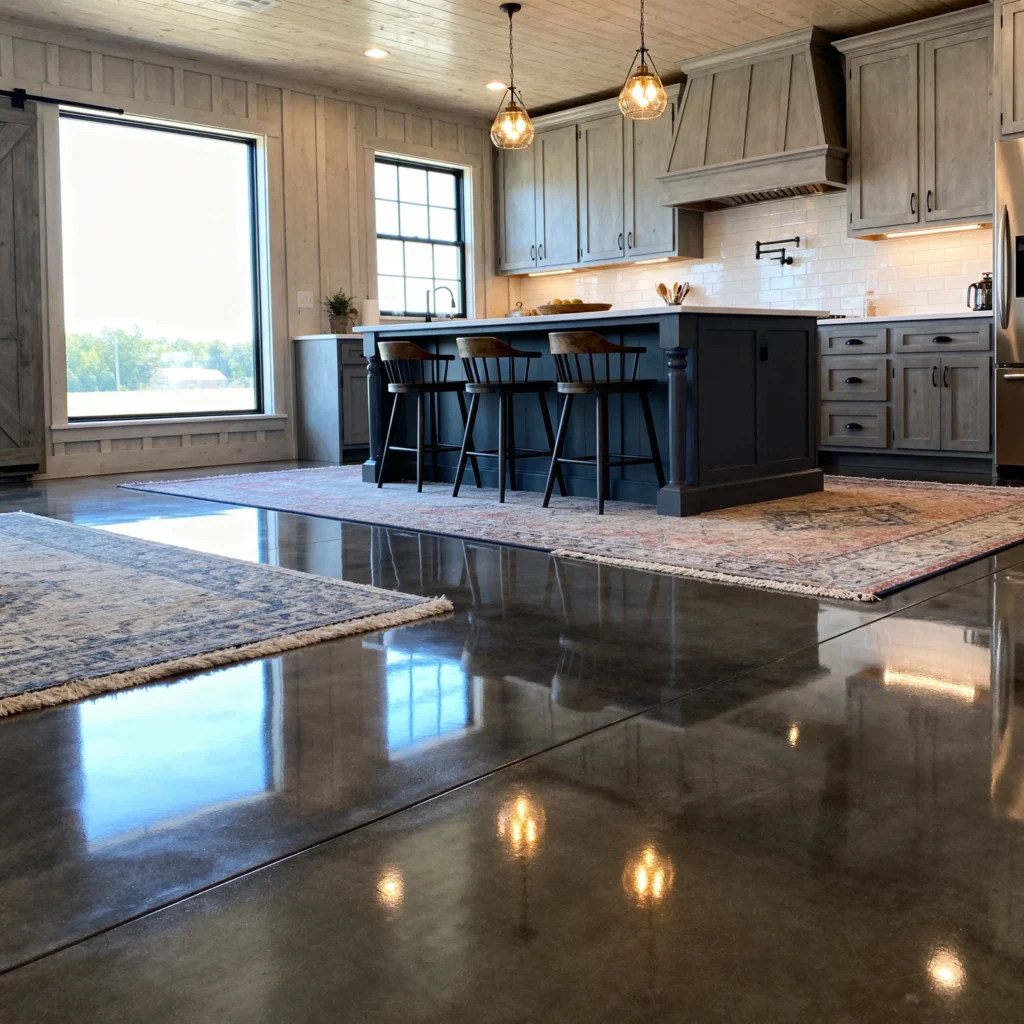
Seamless polished concrete flooring extending from the barndominium kitchen through the open living area — its smooth, slightly reflective surface in a warm grey tone that picks up and distributes the kitchen’s pendant lights and the living area’s natural window light across its continuous horizontal plane — is the barndominium kitchen design idea that most architecturally and most materially honestly connects the kitchen’s finish specification to the building’s own construction material, using the concrete floor slab that the barndominium structure requires as its foundation as the finish surface that the kitchen inhabits rather than covering it with a separate applied flooring material that would disconnect the kitchen’s visual program from its structural substrate. The polished concrete floor is the barndominium’s most architecturally authentic flooring option — its material identity as the building’s own structural slab polished to a reflective finish rather than covered or replaced communicating the design philosophy of material honesty that the barndominium’s exposed structure advocates at every level from the steel beams overhead to the concrete ground plane underfoot.
Polish the concrete floor to a level that achieves the specific combination of reflectivity and surface texture most appropriate for the barndominium kitchen’s domestic use — a medium-grit final polish of approximately 800 to 1500 grit that creates a semi-reflective surface whose light distribution capacity brightens the kitchen without the mirror-like reflection of a very high grit polish that reveals every footprint and requires constant maintenance. Apply a penetrating concrete densifier before the final polishing passes — the densifier chemically reacting with the concrete’s calcium hydroxide to produce additional calcium silicate hydrate crystals that fill the concrete’s surface pores and increase its hardness, improving the polished surface’s resistance to the water spills, oil drips, and abrasion of intensive kitchen floor use. Seal the finished polished surface with a topical concrete sealer whose chemical resistance specifically addresses the food preparation acids — citric, acetic, and lactic acids from common kitchen ingredients — that would stain or etch an unsealed polished concrete surface in daily use, maintaining the floor’s polished appearance and its practical service quality through the years of the barndominium kitchen’s continuous intensive use.
12. Farmhouse Table as Kitchen Island Alternative
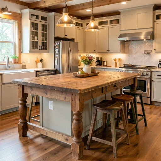
A large reclaimed wood farmhouse table used as the kitchen island — its turned legs, its thick timber top with visible aging, repair patches, and the accumulated surface character of decades of family use, and its slightly variable height and footprint creating the specific quality of an object with genuine history and genuine personality that no purpose-built island can replicate — is the barndominium kitchen design idea that most creatively, most personally, and most eccentrically celebrates the barndominium’s rural heritage by placing a genuine antique of agricultural domestic life at the center of the modern kitchen, creating the most humanly rich and most historically resonant version of the kitchen island concept from a piece of furniture that existed long before the kitchen island as a designed fixture was conceived. The farmhouse table island is the kitchen’s single most characterful piece of furniture — its imperfections, its aging, and its evident previous life as a gathering surface for other families and other meals contributing to the current kitchen’s identity and story in a way that no designed, new, or purpose-built island can approach.
Source the farmhouse table from an antique dealer specializing in country furniture — selecting a piece whose dimensions are genuinely appropriate for island use, with a minimum width of 900 millimeters for practical work surface functionality and a length appropriate to the kitchen’s floor plan without compromising circulation, rather than selecting purely for aesthetic character and then attempting to make an inappropriately sized table function as a practical island. Assess the table’s structural integrity carefully before committing to its use as a kitchen island — the joint connections between legs and apron, the rigidity of the top boards’ edge joints, and the overall stability of the piece under the lateral forces of daily kitchen use all requiring evaluation against the specific physical demands of island use that exceed what the table experienced in its original dining function. Stabilize any loose joints with appropriate wood adhesive and clamp the repaired connections for sufficient curing time before loading the table with kitchen use, maintaining the table’s original character and visible aging while ensuring the structural reliability that daily kitchen island use requires. Refinish the top surface with a food-safe penetrating oil — mineral oil or a dedicated cutting board oil — rather than a film-forming finish that would obscure the top’s aging character with a uniform plastic coating, maintaining the visual honesty of the aged timber surface while providing practical food safety and moisture resistance.
13. Dark Cabinetry with Warm Wood Accents
Deep forest green cabinetry paired with warm walnut floating shelves and a natural wood island top — the dark, saturated green of the cabinets creating the most grounded, most nature-connected color choice available in the contemporary kitchen palette, and the walnut’s rich, chocolate-brown warmth providing the essential organic counterbalance that prevents the dark cabinetry from reading as cold or institutional — is the barndominium kitchen design idea that most sophisticatedly and most seasonally connects the kitchen’s color story to the specific landscape context of the rural barndominium’s site, whose forest, field, and woodland surroundings provide the most immediate and most appropriate color reference for a kitchen that faces and participates in that landscape through its generous window openings throughout every day of its use. Forest green in a kitchen whose windows overlook actual forest is not a trendy color choice but a genuinely site-responsive material decision whose logic is as ecological as it is aesthetic.
Choose the specific forest green paint in a depth and saturation calibrated to the kitchen’s natural light levels — a deeper, more saturated forest green performing most beautifully in a well-lit barndominium kitchen with generous south or west-facing windows that provide the bright, warm light that saturated colors require for their full depth and richness to be visible, while a slightly lighter, more desaturated version of the same green hue serves a less well-lit kitchen more appropriately by maintaining the color’s forest reference without the darkness that insufficient light creates in a deeply saturated color. Install the walnut floating shelves at the specific positions where their warm wood tone most effectively mediates between the dark green cabinet surfaces and the white ceiling — typically the positions between the upper cabinets and the ceiling, where the walnut shelf creates a transitional material layer between the dark below and the light above rather than placing the most extreme contrast of dark cabinet and white ceiling in direct proximity. Specify the quartz perimeter countertops in a white with warm grey veining — the warmth of the grey veining connecting the countertop to the walnut’s warm brown tones and preventing the white countertop surface from appearing cold or stark against the forest green cabinet face below it.
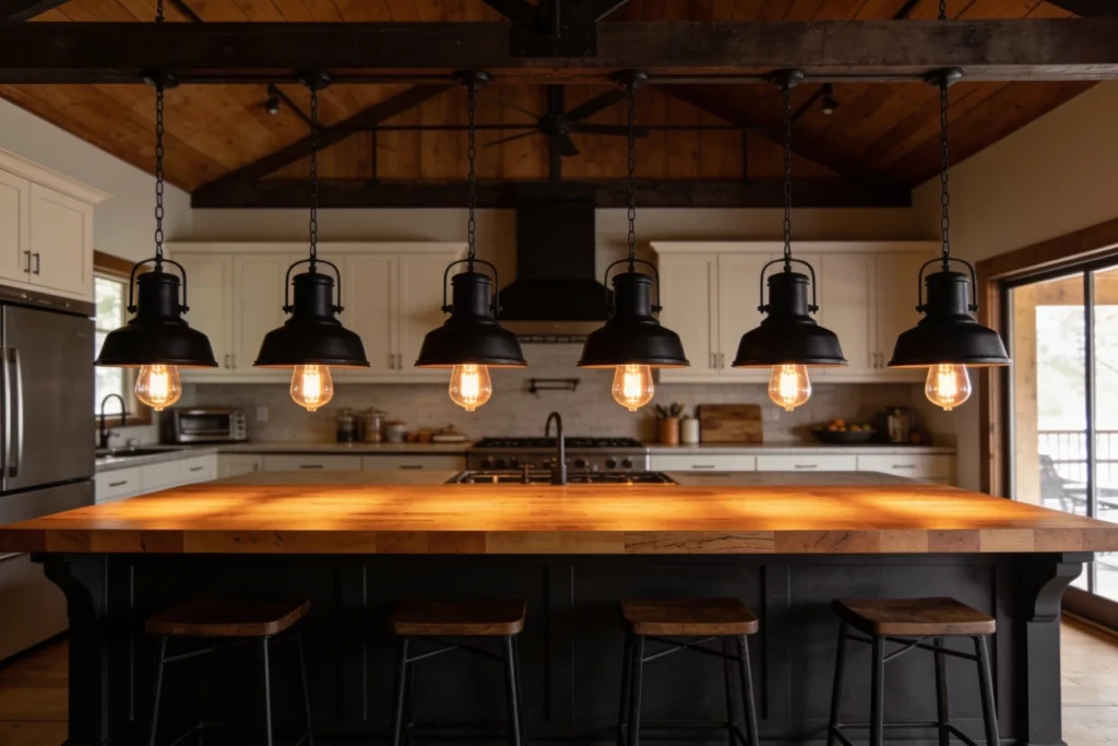
14. Vintage Industrial Pendant Lights in a Row
Five vintage industrial pendant lights hanging in a perfectly spaced, precisely aligned row above the kitchen island — their matte black shades with visible Edison bulb filaments creating the warm amber pools of light on the butcher block surface below that make the island the kitchen’s most warmly illuminated and most visually inviting zone at every hour of day and evening — is the barndominium kitchen design idea that most powerfully uses the linear pendant row as both a functional lighting system and a compositional architectural element that anchors the kitchen’s design language and creates the specific quality of deliberate, linear visual order that makes a row of identical pendants so much more architecturally impactful than the same number of pendants in varied positions or varied forms. The linear pendant row is the barndominium kitchen’s single most architecturally decisive lighting decision — its horizontal line of identical forms suspended in precise alignment creating a visual statement of intentional design that reads clearly from every position in the open-plan living area and that defines the island as the kitchen’s primary spatial and social focal point through the specificity and the warmth of its dedicated lighting.
Specify the pendant spacing at equal intervals measured from shade center to shade center — typically 450 to 600 millimeters between centers for a row of pendants whose individual shade diameter is approximately 300 millimeters — for the most visually balanced and most compositionally harmonious pendant row that avoids both the overcrowded appearance of too-close spacing and the disconnected appearance of too-wide spacing that prevents the individual pendants from reading as a unified compositional element. Suspend all five pendants from a single continuous electrical track running the full length of the island — the track installation ensuring that the pendants hang in true alignment from a single consistent datum line rather than the inevitable slight misalignment that individual ceiling canopy installations produce when the ceiling itself has any unevenness or when the installation tolerances of separate canopies accumulate across the row’s full length. Specify the suspension cable length to position the pendant shade’s lower edge at precisely 750 millimeters above the island’s countertop surface — the height that balances the practical requirement for unobstructed counter use with the visual requirement for the shade to be close enough to the work surface that the light pool it creates on the countertop is concentrated and warm rather than diffuse and cool.
15. Subway Tile Backsplash with Contrasting Grout
White subway tile with dark charcoal grout — each tile’s individual form made clearly and graphically legible by the contrasting dark grout line that defines its perimeter, the collective effect of thousands of grout-outlined tiles creating a rich, grid-patterned backsplash surface whose visual complexity and material character exceed what the same tile with matching white grout would produce by replacing the tile field’s uniform white surface with a highly articulated surface of individual tile forms separated by clear, dark lines — is the barndominium kitchen design idea that most classically and most timelessly expresses the design intelligence of using a single, simple material contrast to transform a potentially monotonous tile installation into a backsplash of genuine visual richness and graphic interest. The white subway tile with dark grout is the barndominium kitchen’s most historically resonant tile specification — the original early twentieth century subway tiles of New York’s underground system using the same white ceramic body and the same dark portland cement grout that provides the specific graphic quality of individually legible tiles that has made this combination continuously beautiful across a century of domestic and institutional application.
Specify the subway tile in a genuine white ceramic body with a glossy glaze — the glossy surface creating the light reflection that subway tiles are historically known for and that makes the backsplash most luminous and most spatially expansive in the kitchen’s ambient light — rather than the matte finish that contemporary tile design offers as an alternative but that lacks the specific reflective quality that the classic subway tile aesthetic requires for its most authentic expression. Mix the grout in a genuine charcoal tone — darker than grey but not quite black, with sufficient warmth in the tone to avoid the starkness of a true black grout in a context where the white tile and the charcoal grout’s high contrast creates sufficient graphic impact without the additional harshness of the maximum possible contrast. Apply the grout with specific attention to the joint depth and the surface finishing — raking the joints to a consistent depth that creates a uniform visual channel rather than filling flush with the tile surface or leaving an inconsistently shallow profile, and cleaning the tile faces before the grout sets with sufficient thoroughness to remove all grout haze before it cures to a permanent, difficult-to-remove film on the tile surface.
16. Smart Kitchen Technology in a Rustic Setting
Smart kitchen technology integrated seamlessly within the barndominium’s rustic aesthetic — a touchscreen display fitted behind a wood-paneled cabinet face that swings open to reveal the screen while appearing as a regular cabinet door when closed, a smart induction cooktop flush-mounted within the butcher block island surface with no raised edges or visible controls beyond the touch-sensitive glass face, voice-controlled LED lighting throughout the kitchen that responds to spoken commands without any visible switches or panels on the wall surfaces, and a whole-home audio system with ceiling-mounted speakers concealed behind the timber tongue-and-groove ceiling panels — is the barndominium kitchen design idea that most cleverly and most intelligently resolves the specific tension between the barndominium’s aesthetic commitment to honest, traditional, natural materials and the contemporary household’s genuine expectation of advanced technology convenience, achieving the complete functionality of the most technologically sophisticated kitchen without the visual presence of a single piece of consumer technology that would compromise the kitchen’s rustic character.
Conceal the smart home hub — the central processing unit of the kitchen’s integrated technology system — within a dedicated section of the pantry or utility cabinet whose door remains permanently closed during normal kitchen use, with all visible technology interactions occurring through the touch panels, voice interfaces, and flush-mounted surfaces that appear as architectural rather than technological elements from the kitchen’s social zones. Specify the smart induction cooktop in a glass color that most closely approximates the butcher block’s warm timber tone when the cooktop is inactive — several manufacturers offering the cooktop glass in warm, tinted versions that read as part of the timber surface rather than as a contrasting black rectangle installed into the wood. Integrate the whole-home audio speakers within the kitchen ceiling during the tongue-and-groove installation — cutting the speaker grille openings into the ceiling boards before installation and installing the speakers flush with the board surface so that the completed ceiling shows only the circular grille openings that read as ceiling details rather than technology intrusions into the timber-clad kitchen overhead.
17. Oversized Range with Pot Filler
An oversized professional-grade range — a forty-eight or sixty-inch commercial-style cooking appliance in deep charcoal, midnight blue, or heritage red that functions as the kitchen’s heroic centerpiece — positioned beneath a custom plaster or timber hood with an articulating pot filler mounted on the adjacent wall at a height that swings the faucet precisely over the range’s largest burner position is the barndominium kitchen design idea that most ambitiously and most aspirationally declares the kitchen’s identity as a serious cooking environment rather than a domestic convenience space whose appliance specification reflects minimum functional requirements rather than the genuine culinary ambitions of the household that chose the barndominium’s expansive, agriculture-adjacent setting partly for the lifestyle of cooking, preserving, and feeding that the countryside most naturally inspires and most generously accommodates. The oversized range is the barndominium kitchen’s most powerful single statement — its scale, its professional specification, and its commanding visual presence communicating the kitchen’s genuine purpose as the household’s most important room.
Choose the range’s color as a genuine design decision rather than defaulting to the stainless steel that professional equipment most commonly offers — the deep, saturated colors available from specialist range manufacturers including La Cornue, Lacanche, and Ilve creating a visual presence and a personal identity for the kitchen’s cooking wall that stainless steel, however impeccably finished, cannot provide. A deep charcoal range creates the most sophisticated and most universally harmonious color relationship with the barndominium kitchen’s typical material palette of white cabinetry, warm timber, and dark structural steel — its dark, slightly warm tone connecting to the structural steel’s mill scale color while providing sufficient color depth to read as a genuinely colored appliance rather than simply a dark neutral. Install the pot filler at a height that positions the filler’s horizontal arm precisely over the range’s largest burner when the arm is fully extended — typically 600 to 800 millimeters above the range’s cooking surface — and specify a genuine brass or unlacquered metal finish that creates a warm metallic accent on the cooking wall’s hardware vocabulary.
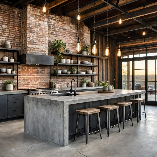
18. Reclaimed Wood Feature Wall Behind Island
A full reclaimed wood feature wall behind the kitchen island — its weathered barn wood planks in varying widths, varying surface tones from silver-grey to warm amber, and varying degrees of surface character including nail holes, saw marks, and paint traces creating a richly textured backdrop of genuine agricultural material heritage against which the island floats as a clean, designed counterpoint — is the barndominium kitchen design idea that most completely and most monumentally brings the specific material culture of the American agricultural building tradition into the kitchen’s most visible and most socially prominent wall surface, creating the barndominium kitchen’s most authentically characterized and most personally resonant design moment. The reclaimed wood feature wall is the kitchen’s most powerful material statement — its entire visual surface area devoted to a single material whose every plank tells part of the larger story of the rural structures that provided the boards, and whose collective presence creates the most genuine and most emotionally resonant connection between the kitchen’s interior design and the barndominium’s building heritage.
Source the reclaimed barn wood from a specialist supplier who can confirm the provenance of the material and provide sufficient quantity of boards with consistent aging character to cover the feature wall’s full surface area without the visual inconsistency of boards from incompatible source structures whose surface characters conflict rather than complement each other in the assembled installation. Install the boards in a mixed-width arrangement — alternating wide boards of approximately 200 to 300 millimeters with narrow boards of approximately 75 to 100 millimeters — that creates the visually interesting, non-repetitive rhythm of traditional barn wood siding whose individual board widths were determined by the available timber rather than by a design specification, creating the organic variety that is the reclaimed wall’s most authentic and most visually compelling quality. Treat the installed boards with a penetrating clear preservative oil — working it into the wood’s surface to stabilize the weathered fiber and prevent further deterioration from interior humidity variations while maintaining the boards’ silvered, weathered appearance rather than the darkened, oil-saturated surface that a heavier oil application would create.